
Snap
Branding a full-service agency
Brand & Identity
Web Design
Motion Design
Overview
Snap is a full-service creative agency entering a new phase of growth. As the agency evolved, the brand no longer reflected the standard of work or ambition of the team. The rebrand was an opportunity to redefine how Snap presents itself; more premium, more confident, but still creative and energetic at its core.
The design team was each tasked with developing a rebrand concept. My direction was selected, and I went on to lead the project through to launch.
Overview
CHALLENGE
Overview
Branding your own agency is uniquely complex.
Snap’s visual presence had become fragmented. Over time, different campaigns, decks and materials had been created in isolation, leading to a disjointed brand landscape. There was no clear system holding everything together.
At the same time, the agency had matured. The quality of thinking and execution had elevated, but the identity had not kept pace.
The challenge was twofold: unify the brand into a cohesive system while evolving it into something more premium and future-facing. It needed to feel modern and design-led, yet flexible enough to accommodate a wide range of client sectors and creative outputs.
APPROACH
Overview
My concept centred on clarity, structure and controlled expression. I rebuilt the identity from the ground up, introducing a new logo, refined colour system and flexible motion framework. The direction aimed to feel contemporary and confident, while still retaining a sense of creativity and energy.
A key priority was building a system rather than a static aesthetic. Clear typographic hierarchy, compositional rules and colour logic created consistency across all materials, replacing fragmentation with structure.
As Creative Lead on the project, I also directed the wider design team. I worked closely with a colleague to define and curate the illustration style, ensuring it aligned with the new identity. Alongside this, I oversaw the development of supporting collateral created by other designers, making sure the brand was applied consistently and with intent.
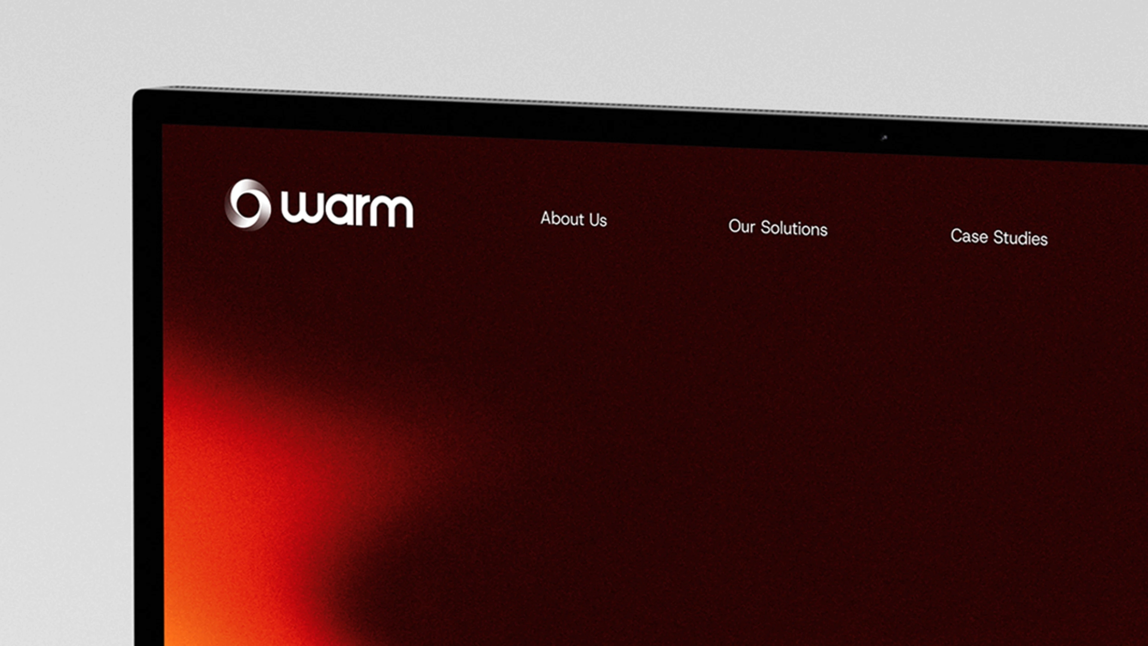
The website became a central expression of the identity. Interactivity was intentionally embedded into the experience, with custom components and considered motion behaviours designed to feel purposeful rather than decorative. I defined the interaction principles and guided implementation to ensure the digital experience reflected the ambition of the brand.
Throughout the process, I balanced collaboration with conviction, navigating input from multiple levels of the business while protecting the integrity of the design direction.
ROLES & DELIVERABLES
ROLE & DELIVERABLES
Overview
My Role
Creative Lead
I developed the selected rebrand concept and led the project from direction through to rollout, overseeing the design team and ensuring consistent application across all brand outputs.
Brand identity & logo refinement
Visual system & colour palette
Typography selection
Motion & interaction design
Art direction & imagery
UI & layout design
Deliverables
Brand identity redevelopment
Logo redesign
Colour palette and typographic system
Motion identity framework
Brand guidelines
Pitch presentation templates
Website art direction and full design
Interaction principles and component direction
Illustration style direction
Creative oversight of supporting brand collateral
THE RESULT
Overview
The rebrand unified Snap under a clear and confident visual system. The identity now reflects the agency’s maturity and creative standard, presenting a more premium and cohesive presence across all touchpoints.
What was previously fragmented is now structured and flexible, capable of adapting across a diverse client portfolio without losing consistency.
Internally, it established a higher benchmark for quality and alignment. Externally, it positions Snap as a more assured and design-led agency.
LEARNING
Overview
Insights I learned from this project:
This project strengthened my ability to lead creatively while maintaining clarity of vision.
Rebranding an agency with years of accumulated materials reinforced the importance of systems over aesthetics. Cohesion comes from structure and guidance, not just visual refresh.
It also deepened my understanding of leadership within design. Ensuring others fully understand and confidently apply a brand is as important as creating it.
Snap
Branding a full-service agency
Brand & Identity
Web Design
Motion Design
PORTFOLIO
More Projects
More Projects
More Projects

Snap
Branding a full-service agency
Brand & Identity
Web Design
Motion Design
Overview
Snap is a full-service creative agency entering a new phase of growth. As the agency evolved, the brand no longer reflected the standard of work or ambition of the team. The rebrand was an opportunity to redefine how Snap presents itself; more premium, more confident, but still creative and energetic at its core.
The design team was each tasked with developing a rebrand concept. My direction was selected, and I went on to lead the project through to launch.
Overview
CHALLENGE
Branding your own agency is uniquely complex.
Snap’s visual presence had become fragmented. Over time, different campaigns, decks and materials had been created in isolation, leading to a disjointed brand landscape. There was no clear system holding everything together.
At the same time, the agency had matured. The quality of thinking and execution had elevated, but the identity had not kept pace.
The challenge was twofold: unify the brand into a cohesive system while evolving it into something more premium and future-facing. It needed to feel modern and design-led, yet flexible enough to accommodate a wide range of client sectors and creative outputs.
APPROACH
My concept centred on clarity, structure and controlled expression. I rebuilt the identity from the ground up, introducing a new logo, refined colour system and flexible motion framework. The direction aimed to feel contemporary and confident, while still retaining a sense of creativity and energy.
A key priority was building a system rather than a static aesthetic. Clear typographic hierarchy, compositional rules and colour logic created consistency across all materials, replacing fragmentation with structure.
As Creative Lead on the project, I also directed the wider design team. I worked closely with a colleague to define and curate the illustration style, ensuring it aligned with the new identity. Alongside this, I oversaw the development of supporting collateral created by other designers, making sure the brand was applied consistently and with intent.
The website became a central expression of the identity. Interactivity was intentionally embedded into the experience, with custom components and considered motion behaviours designed to feel purposeful rather than decorative. I defined the interaction principles and guided implementation to ensure the digital experience reflected the ambition of the brand.
Throughout the process, I balanced collaboration with conviction, navigating input from multiple levels of the business while protecting the integrity of the design direction.
ROLES & DELIVERABLES
My Role
Creative Lead
I developed the selected rebrand concept and led the project from direction through to rollout, overseeing the design team and ensuring consistent application across all brand outputs.
Deliverables
Brand identity redevelopment
Logo redesign
Colour palette and typographic system
Motion identity framework
Brand guidelines
Pitch presentation templates
Website art direction and full design
Interaction principles and component direction
Illustration style direction
Creative oversight of supporting brand collateral
THE RESULT
The rebrand unified Snap under a clear and confident visual system. The identity now reflects the agency’s maturity and creative standard, presenting a more premium and cohesive presence across all touchpoints.
LEARNING
Insights I learned from this project:
Snap
Branding a full-service agency
Brand & Identity
Web Design
Motion Design
PORTFOLIO
More Projects
More Projects
More Projects
Snap
Branding a full-service agency
Brand & Identity
Web Design
Motion Design
Overview
Snap is a full-service creative agency entering a new phase of growth. As the agency evolved, the brand no longer reflected the standard of work or ambition of the team. The rebrand was an opportunity to redefine how Snap presents itself; more premium, more confident, but still creative and energetic at its core.
The design team was each tasked with developing a rebrand concept. My direction was selected, and I went on to lead the project through to launch.
Overview
CHALLENGE
Branding your own agency is uniquely complex.
Snap’s visual presence had become fragmented. Over time, different campaigns, decks and materials had been created in isolation, leading to a disjointed brand landscape. There was no clear system holding everything together.
At the same time, the agency had matured. The quality of thinking and execution had elevated, but the identity had not kept pace.
The challenge was twofold: unify the brand into a cohesive system while evolving it into something more premium and future-facing. It needed to feel modern and design-led, yet flexible enough to accommodate a wide range of client sectors and creative outputs.
APPROACH
My concept centred on clarity, structure and controlled expression. I rebuilt the identity from the ground up, introducing a new logo, refined colour system and flexible motion framework. The direction aimed to feel contemporary and confident, while still retaining a sense of creativity and energy.
A key priority was building a system rather than a static aesthetic. Clear typographic hierarchy, compositional rules and colour logic created consistency across all materials, replacing fragmentation with structure.
As Creative Lead on the project, I also directed the wider design team. I worked closely with a colleague to define and curate the illustration style, ensuring it aligned with the new identity. Alongside this, I oversaw the development of supporting collateral created by other designers, making sure the brand was applied consistently and with intent.
The website became a central expression of the identity. Interactivity was intentionally embedded into the experience, with custom components and considered motion behaviours designed to feel purposeful rather than decorative. I defined the interaction principles and guided implementation to ensure the digital experience reflected the ambition of the brand.
Throughout the process, I balanced collaboration with conviction, navigating input from multiple levels of the business while protecting the integrity of the design direction.
ROLES & DELIVERABLES
My Role
Creative Lead
I developed the selected rebrand concept and led the project from direction through to rollout, overseeing the design team and ensuring consistent application across all brand outputs.
Deliverables
Brand identity redevelopment
Logo redesign
Colour palette and typographic system
Motion identity framework
Brand guidelines
Pitch presentation templates
Website art direction and full design
Interaction principles and component direction
Illustration style direction
Creative oversight of supporting brand collateral
THE RESULT
The rebrand unified Snap under a clear and confident visual system. The identity now reflects the agency’s maturity and creative standard, presenting a more premium and cohesive presence across all touchpoints.
What was previously fragmented is now structured and flexible, capable of adapting across a diverse client portfolio without losing consistency.
Internally, it established a higher benchmark for quality and alignment. Externally, it positions Snap as a more assured and design-led agency.
LEARNING
Insights I learned from this project:
This project strengthened my ability to lead creatively while maintaining clarity of vision.
Rebranding an agency with years of accumulated materials reinforced the importance of systems over aesthetics. Cohesion comes from structure and guidance, not just visual refresh.
It also deepened my understanding of leadership within design. Ensuring others fully understand and confidently apply a brand is as important as creating it.
Snap
Branding a full-service agency
Brand & Identity
Web Design
Motion Design
PORTFOLIO