

Bouk
Bouk
Designing an effortless booking platform
Brand & Identity
Web Design
2025
Overview
Bouk is a booking platform designed to take the stress out of reservations and scheduling. From boutique hotels to large venues, spas and appointment-driven environments, Bouk helps operators streamline bookings with clarity and ease.
The platform existed before, but its identity and visual language felt clunky and disconnected from the simplicity and reliability it aimed to provide.
Bouk is a booking platform designed to take the stress out of reservations and scheduling. From boutique hotels to large venues, spas and appointment-driven environments, Bouk helps operators streamline bookings with clarity and ease. The platform existed before, but its identity and visual language felt clunky and disconnected from the simplicity and reliability it aimed to provide.


CHALLENGE
The previous identity didn’t reflect the product’s purpose. As a tool designed to simplify complexity, Bouk needed a visual language that felt effortless, intuitive and welcoming - not generic or cumbersome.
The core challenge was translating the platform’s utility, its simplicity and ease, into a visual system that felt confident and supportive, while aligning with strategic positioning developed by my colleagues.


APPROACH
The identity was developed directly from the product itself.
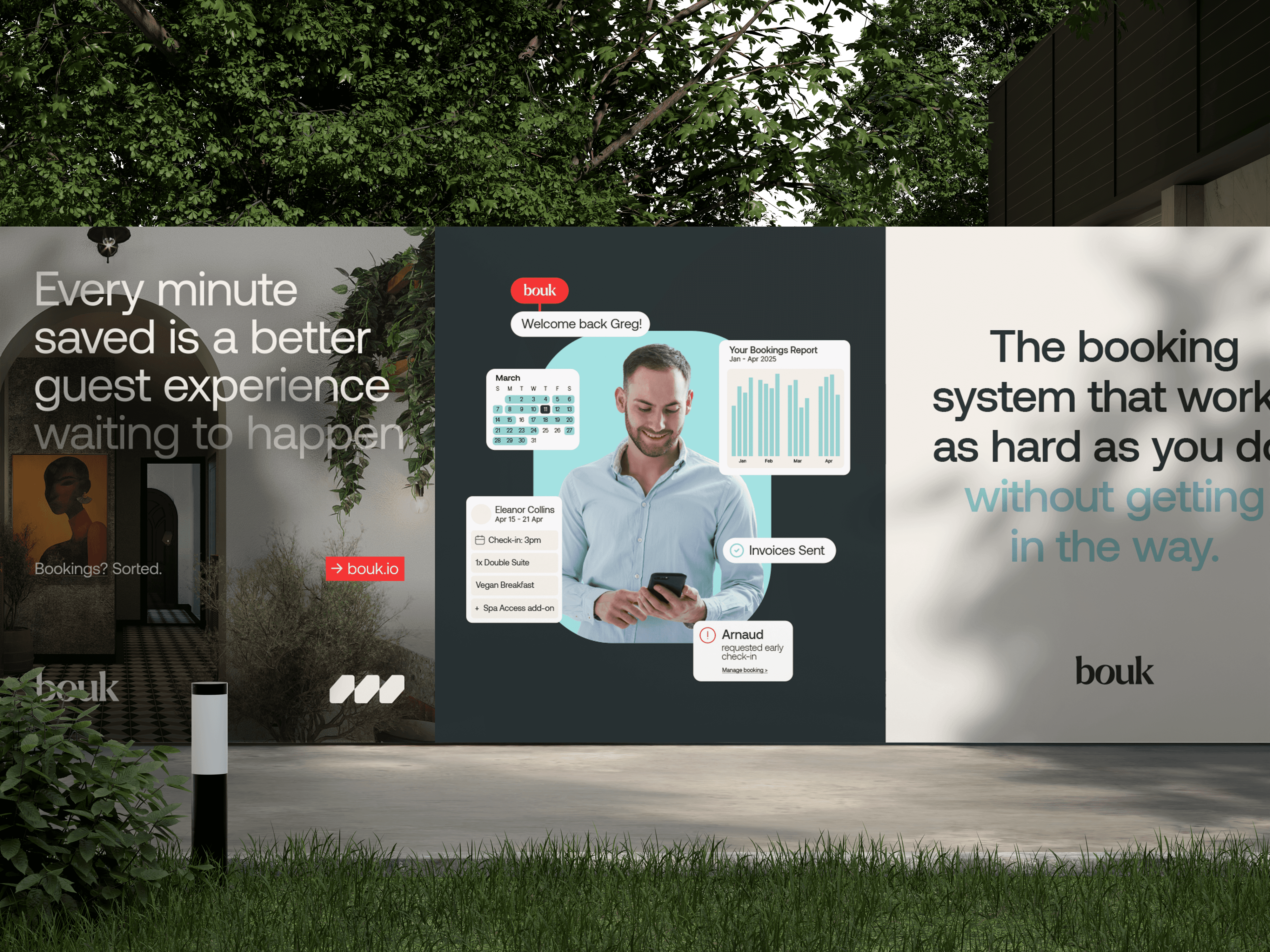
Bouk is a platform built around speed and ease of use across devices, so the brand needed to feel native to that experience. Rather than designing a visual system separate from the product, I drew from the UI patterns that define how the platform works. Buttons, cards, toggles and form fields became the foundation of the identity, evolving into a set of graphic elements that echo the product’s interface logic.
This approach allowed the brand to feel inherently digital. The visual language mirrors the clarity and structure of the platform, reinforcing Bouk’s core promise: a booking system that is powerful but effortless to use.
The rebrand began with a simple question: how do you make something as functional as booking software feel effortless and inviting? I looked to Bouk’s mission—removing hassle and enabling people to focus on what matters—and built a design philosophy around ease, warmth and distinction. Rather than following industry clichés, we aimed to create a visual language that signals reliability without feeling corporate.
The colour palette was designed to feel modern and approachable while remaining professional. Soft off-whites form the base of the system, allowing interface-led elements and product interactions to take visual priority. Typography focuses on clarity and legibility, ensuring the brand communicates effectively across screens and interface contexts.
Photography and UI-derived motifs were used sparingly and purposefully to reinforce usability rather than decoration. The result is a flexible identity that works comfortably across hospitality, events and service industries while maintaining a consistent sense of simplicity and efficiency.
Key to this was establishing a sense of calm. I explored ways to translate the ethos of “less faff, more flow” into every element of the brand. We knew the identity had to stand apart from competitors, so I worked on a bespoke mark that feels both modern and approachable. To humanise the technology, the visual direction leaned into genuine human moments and thoughtful composition. At the same time, the interface framework needed to be simple and intuitive, so that users could navigate without friction.
ROLE & DELIVERABLES
My Role
Lead Designer - I was responsible for shaping the entire visual brand identity.
As the lead and sole designer, I oversaw the entire creative process:
Designed a stylised logo and supporting marks
Developed a user‑friendly, UI‑led design system
Selected and implemented typography and colour palette
Directed photography and imagery style
Conceptualised motion and interaction guidelines
Produced social and marketing templates
Deliverables
Brand identity system
Logo and logomark suite
Colour palette and UI-informed visual language
Typography and hierarchy
Key brand assets and compositional templates
Motion principles for UI and promotional use
Web Design (still in development)
Comprehensive logo suite with clear usage guidelines
Typographic hierarchy (Aeonik & Inter) and colour system
Modular UI components and layout standards
Photography direction and editorial guidelines
Motion and iconography design language
Social and marketing assets aligned with the content strategy


OUTCOME
Bouk now has a defined and cohesive brand identity that reflects its product promise.
The stylised logo offers distinction, the UI system brings clarity and ease of use, and the photography and colour palette humanise the technology. Together, these elements communicate Bouk’s promise of effortless bookings and support its goal of helping businesses focus on delivering great experiences.
LEARNINGS
Insights I learned from this project:
This project reinforced how closely product and brand should work together.
By building the visual language from the platform’s own interface patterns, the identity feels intuitive and relevant to the experience itself. Rather than decorating the product, the brand becomes an extension of how it behaves.

Bouk
Designing an effortless booking platform
Brand & Identity
Web Design
PORTFOLIO
More Projects
More Projects
More Projects

Bouk
Designing an effortless booking platform
Brand & Identity
Web Design
2025
Overview
Bouk is a booking platform designed to take the stress out of reservations and scheduling. From boutique hotels to large venues, spas and appointment-driven environments, Bouk helps operators streamline bookings with clarity and ease.
The platform existed before, but its identity and visual language felt clunky and disconnected from the simplicity and reliability it aimed to provide.
CHALLENGE
The previous identity didn’t reflect the product’s purpose. As a tool designed to simplify complexity, Bouk needed a visual language that felt effortless, intuitive and welcoming - not generic or cumbersome.
The core challenge was translating the platform’s utility, its simplicity and ease, into a visual system that felt confident and supportive, while aligning with strategic positioning developed by my colleagues.
APPROACH
The identity was developed directly from the product itself.
Bouk is a platform built around speed and ease of use across devices, so the brand needed to feel native to that experience. Rather than designing a visual system separate from the product, I drew from the UI patterns that define how the platform works. Buttons, cards, toggles and form fields became the foundation of the identity, evolving into a set of graphic elements that echo the product’s interface logic.
This approach allowed the brand to feel inherently digital. The visual language mirrors the clarity and structure of the platform, reinforcing Bouk’s core promise: a booking system that is powerful but effortless to use.
The colour palette was designed to feel modern and approachable while remaining professional. Soft off-whites form the base of the system, allowing interface-led elements and product interactions to take visual priority. Typography focuses on clarity and legibility, ensuring the brand communicates effectively across screens and interface contexts.
Photography and UI-derived motifs were used sparingly and purposefully to reinforce usability rather than decoration. The result is a flexible identity that works comfortably across hospitality, events and service industries while maintaining a consistent sense of simplicity and efficiency.
ROLE & DELIVERABLES
My Role
Lead Designer - I was responsible for shaping the entire visual brand identity.
Deliverables
Brand identity system
Logo and logomark suite
Colour palette and UI-informed visual language
Typography and hierarchy
Key brand assets and compositional templates
Motion principles for UI and promotional use
Web Design (still in development)
OUTCOME
Bouk now has a defined and cohesive brand identity that reflects its product promise.
The stylised logo offers distinction, the UI system brings clarity and ease of use, and the photography and colour palette humanise the technology. Together, these elements communicate Bouk’s promise of effortless bookings and support its goal of helping businesses focus on delivering great experiences.
LEARNINGS
Insights I learned from this project:
This project reinforced how closely product and brand should work together.
By building the visual language from the platform’s own interface patterns, the identity feels intuitive and relevant to the experience itself. Rather than decorating the product, the brand becomes an extension of how it behaves.
Bouk
Designing an effortless booking platform
Brand & Identity
Web Design
PORTFOLIO
More Projects
More Projects
More Projects
Bouk
Designing an effortless booking platform
Brand & Identity
Web Design
2025
Overview
Bouk is a booking platform designed to take the stress out of reservations and scheduling. From boutique hotels to large venues, spas and appointment-driven environments, Bouk helps operators streamline bookings with clarity and ease. The platform existed before, but its identity and visual language felt clunky and disconnected from the simplicity and reliability it aimed to provide.
CHALLENGE
The previous identity didn’t reflect the product’s purpose. As a tool designed to simplify complexity, Bouk needed a visual language that felt effortless, intuitive and welcoming - not generic or cumbersome.
The core challenge was translating the platform’s utility, its simplicity and ease, into a visual system that felt confident and supportive, while aligning with strategic positioning developed by my colleagues.
APPROACH
The identity was developed directly from the product itself.
Bouk is a platform built around speed and ease of use across devices, so the brand needed to feel native to that experience. Rather than designing a visual system separate from the product, I drew from the UI patterns that define how the platform works. Buttons, cards, toggles and form fields became the foundation of the identity, evolving into a set of graphic elements that echo the product’s interface logic.
This approach allowed the brand to feel inherently digital. The visual language mirrors the clarity and structure of the platform, reinforcing Bouk’s core promise: a booking system that is powerful but effortless to use.
The colour palette was designed to feel modern and approachable while remaining professional. Soft off-whites form the base of the system, allowing interface-led elements and product interactions to take visual priority. Typography focuses on clarity and legibility, ensuring the brand communicates effectively across screens and interface contexts.
Photography and UI-derived motifs were used sparingly and purposefully to reinforce usability rather than decoration. The result is a flexible identity that works comfortably across hospitality, events and service industries while maintaining a consistent sense of simplicity and efficiency.
ROLE & DELIVERABLES
My Role
Lead Designer - I was responsible for shaping the entire visual brand identity.
Deliverables
Primary and secondary logomarks
Typography and colour framework
Identity system guidelines
Motion concepts & interaction direction
Curated photography & art direction
Responsive UI design (web)
OUTCOME
Bouk now has a defined and cohesive brand identity that reflects its product promise.
The visual system feels purposeful and approachable, reinforcing the platform’s focus on ease and clarity. The identity gives the product a more confident presence in a competitive marketplace and aligns the brand with the simplicity and accessibility users expect.
LEARNINGS
Insights I learned from this project:
This project reinforced how closely product and brand should work together.
By building the visual language from the platform’s own interface patterns, the identity feels intuitive and relevant to the experience itself. Rather than decorating the product, the brand becomes an extension of how it behaves.
Bouk
Designing an effortless booking platform
Brand & Identity
Web Design
PORTFOLIO