
2025
2025
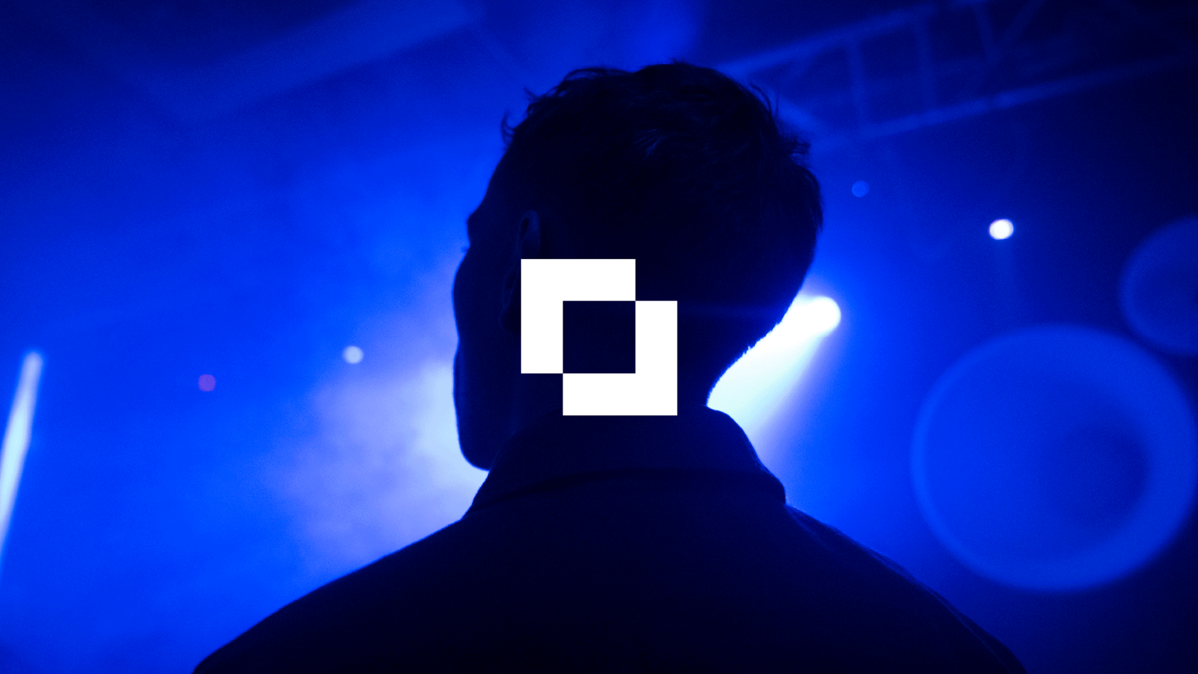
Warm
Warm
Clarity and precision for a technical consultancy company
Brand & Identity
Web Design
Motion Graphics
2025
Overview
Warm is a technical consultancy with a strong focus on delivering efficient solutions for complex systems. They needed a refreshed visual identity that reflected their expertise and communicated clarity, energy and precision.
Warm is a technical consultancy with a strong focus on delivering efficient solutions for complex systems. They needed a refreshed visual identity that reflected their expertise and communicated clarity, energy and precision.
The existing brand lacked cohesion and struggled to express the balance of technical rigour and approachability that defines the business.
The existing brand lacked cohesion and struggled to express the balance of technical rigour and approachability that defines the business.
Warm
Clarity and precision for a technical consultancy company
Brand & Identity
Web Design
Motion Graphics

CHALLENGE
Warm’s previous identity didn’t communicate the technical confidence or visual coherence needed to stand out in its sector. The visual language felt dated and didn’t reflect the brand’s capabilities.
My task was to reframe the brand in a way that felt both structured and energetic, signalling competence without feeling cold or overly technical.
PROBLEM
PROBLEM
APPROACH
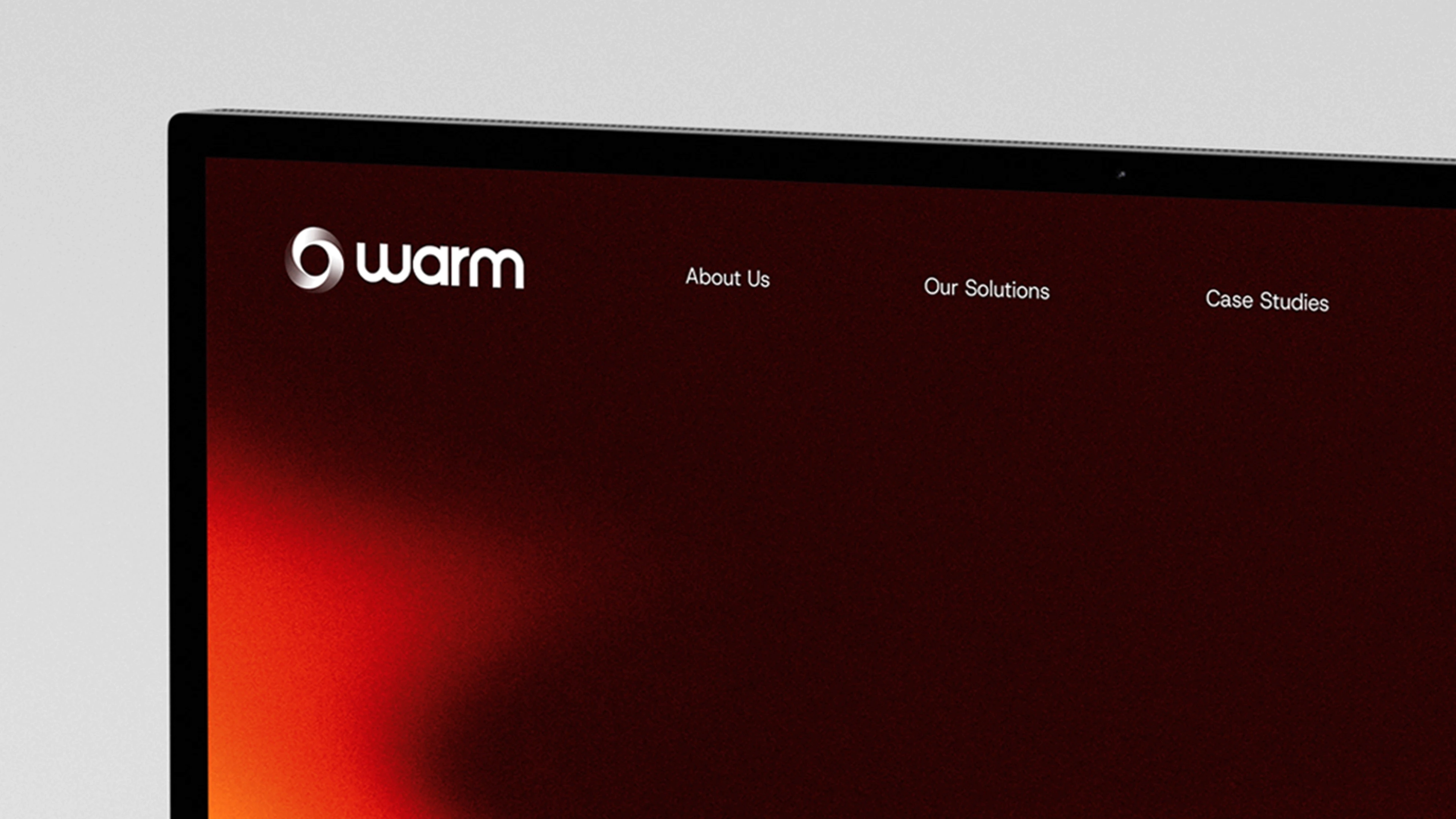
I began by defining the core visual language — a gradient system rooted in warm hues that could communicate both energy and precision. This flexible colour framework became the backbone of the identity, offering a dynamic yet controlled palette.
Typography played a crucial role. I paired a clean sans serif with a more technical typeface to strike a balance between approachability and professionalism. That combination formed a visual rhythm that could scale across formats without losing clarity.
Rather than designing specific outputs in isolation, I developed a system that could adapt and hold together across applications, with clear rules around hierarchy, colour use and typographic structure.
APPROACH
APPROACH
APPROACH
ROLE & DELIVERABLES
My Role
Lead Designer
I defined and executed the refreshed identity, website design, visual system and motion framework.
Brand identity & logo refinement
Visual system & colour palette
Typography selection
Motion & interaction design
Art direction & imagery
UI & layout design
Deliverables
Brand identity redevelopment
Colour system and gradient language
Typographic pairing and hierarchy
Visual language framework
Motion identity elements
Adaptable brand toolkit
ROLE & DELIVERABLES
ROLE & DELIVERABLES
ROLE & DELIVERABLES
PROBLEM
OUTCOME
The refreshed identity elevated Warm from a single logo to a more coherent, confident brand system.
Eatron now owns a refined and cohesive identity that aligns public perception with scientific reality.
The gradient language and typographic pairing gave the business a distinctive visual voice that feels purposeful and recognisable. Across touchpoints, the brand now reflects its technical capability with clarity and energy.
PROBLEM
OUTCOME
PORTFOLIO
PROBLEM
LEARNINGS
Insights I learned from this project:
This project reinforced the value of visual flexibility within technical brands.
Warmth and precision don’t need to be at odds. By building a system that allows expression without inconsistency, it’s possible to communicate both energy and credibility, even within sectors that can easily feel rigid or overly technical.
PROBLEM
LEARNINGS
PORTFOLIO
More Projects
More Projects
More Projects

2025
Warm
Clarity and precision for a technical consultancy company
Brand & Identity
Web Design
Motion Graphics
2025
Overview
Warm is a technical consultancy with a strong focus on delivering efficient solutions for complex systems. They needed a refreshed visual identity that reflected their expertise and communicated clarity, energy and precision.
The existing brand lacked cohesion and struggled to express the balance of technical rigour and approachability that defines the business.
Warm
Clarity and precision for a technical consultancy company
Brand & Identity
Web Design
Motion Graphics
CHALLENGE
Warm’s previous identity didn’t communicate the technical confidence or visual coherence needed to stand out in its sector. The visual language felt dated and didn’t reflect the brand’s capabilities.
My task was to reframe the brand in a way that felt both structured and energetic, signalling competence without feeling cold or overly technical.
PROBLEM
PROBLEM
APPROACH
I began by defining the core visual language — a gradient system rooted in warm hues that could communicate both energy and precision. This flexible colour framework became the backbone of the identity, offering a dynamic yet controlled palette.
Typography played a crucial role. I paired a clean sans serif with a more technical typeface to strike a balance between approachability and professionalism. That combination formed a visual rhythm that could scale across formats without losing clarity.
Rather than designing specific outputs in isolation, I developed a system that could adapt and hold together across applications, with clear rules around hierarchy, colour use and typographic structure.
APPROACH
APPROACH
APPROACH
ROLE & DELIVERABLES
My Role
Lead Designer
I defined and executed the refreshed identity, website design, visual system and motion framework.
Deliverables
Brand identity redevelopment
Colour system and gradient language
Typographic pairing and hierarchy
Visual language framework
Motion identity elements
Adaptable brand toolkit
ROLE & DELIVERABLES
ROLE & DELIVERABLES
ROLE & DELIVERABLES
PROBLEM
The refreshed identity elevated Warm from a single logo to a more coherent, confident brand system.
The gradient language and typographic pairing gave the business a distinctive visual voice that feels purposeful and recognisable. Across touchpoints, the brand now reflects its technical capability with clarity and energy.
PROBLEM
OUTCOME
PORTFOLIO
PROBLEM
Insights I learned from this project:
This project reinforced the value of visual flexibility within technical brands.
Warmth and precision don’t need to be at odds. By building a system that allows expression without inconsistency, it’s possible to communicate both energy and credibility, even within sectors that can easily feel rigid or overly technical.
PROBLEM
LEARNINGS
PORTFOLIO
More Projects
More Projects
More Projects
2025
Warm
Clarity and precision for a technical consultancy company
Brand & Identity
Web Design
Motion Graphics
2025
Overview
Warm is a technical consultancy with a strong focus on delivering efficient solutions for complex systems. They needed a refreshed visual identity that reflected their expertise and communicated clarity, energy and precision.
The existing brand lacked cohesion and struggled to express the balance of technical rigour and approachability that defines the business.
Warm
Clarity and precision for a technical consultancy company
Brand & Identity
Web Design
Motion Graphics
CHALLENGE
Warm’s previous identity didn’t communicate the technical confidence or visual coherence needed to stand out in its sector. The visual language felt dated and didn’t reflect the brand’s capabilities.
My task was to reframe the brand in a way that felt both structured and energetic, signalling competence without feeling cold or overly technical.
PROBLEM
PROBLEM
APPROACH
The brand refresh began with a colour‑driven identity. A gradient system built on warm hues became the core of the visual language, communicating energy and precision across digital, motion and large‑format applications. Typography played a crucial role: the sans-serif Host Grotesk provided a clean, approachable base, while Baj Jamjuree added technical weight. Together they formed a modern voice that balanced professionalism with technical profiency
Typography played a crucial role. I paired a clean sans serif with a more technical typeface to strike a balance between approachability and professionalism. That combination formed a visual rhythm that could scale across formats without losing clarity.
Rather than designing specific outputs in isolation, I developed a system that could adapt and hold together across applications, with clear rules around hierarchy, colour use and typographic structure.
APPROACH
APPROACH
APPROACH
ROLE & DELIVERABLES
My Role
Lead Designer
I defined and executed the refreshed identity, website design, visual system and motion framework.
Deliverables
Primary brand marks & secondary icons
Typography and colour guidelines
Motion studies & animated assets
Responsive UI design (web)
Digital and launch video collateral
ROLE & DELIVERABLES
ROLE & DELIVERABLES
ROLE & DELIVERABLES
PROBLEM
The refreshed identity elevated Warm from a single logo to a more coherent, confident brand system.
The gradient language and typographic pairing gave the business a distinctive visual voice that feels purposeful and recognisable. Across touchpoints, the brand now reflects its technical capability with clarity and energy.
PROBLEM
OUTCOME
PORTFOLIO
LEARNING
Insights I learned from this project:
This project reinforced the value of visual flexibility within technical brands.
Warmth and precision don’t need to be at odds. By building a system that allows expression without inconsistency, it’s possible to communicate both energy and credibility, even within sectors that can easily feel rigid or overly technical.
PROBLEM
LEARNINGS
PORTFOLIO