
BDDFS
Modernising a heritage organisation through identity
Brand & Identity
Web Design
Brand & Identity
Web Design
Motion Design
BDDFS
Modernising a heritage organisation through identity
Brand & Identity
Web Design
Brand & Identity
Web Design
Motion Design
2025
Overview
BDDFS is a financial services firm entering a new chapter. As the business evolved from Business Development Directors into a broader financial services partner, the brand needed to reflect that shift. The identity had to communicate expertise and credibility, while feeling more modern and approachable.
BDDFS is a financial services firm entering a new chapter. As the business evolved from Business Development Directors into a broader financial services partner, the brand needed to reflect that shift. The identity had to communicate expertise and credibility, while feeling more modern and approachable.

CHALLENGE
The previous identity lacked cohesion and contemporary presence. From logo to typography, the brand felt dated and inconsistent. It didn’t reflect the progressive, advisory-led direction the business was moving toward.
The challenge was to create a visual identity that felt professional and trustworthy, without leaning into overly traditional financial aesthetics. It needed to balance authority with accessibility.


APPROACH
I began by refining the brand’s core positioning, ensuring the visual direction aligned with their expanded role as financial partners rather than transactional service providers.
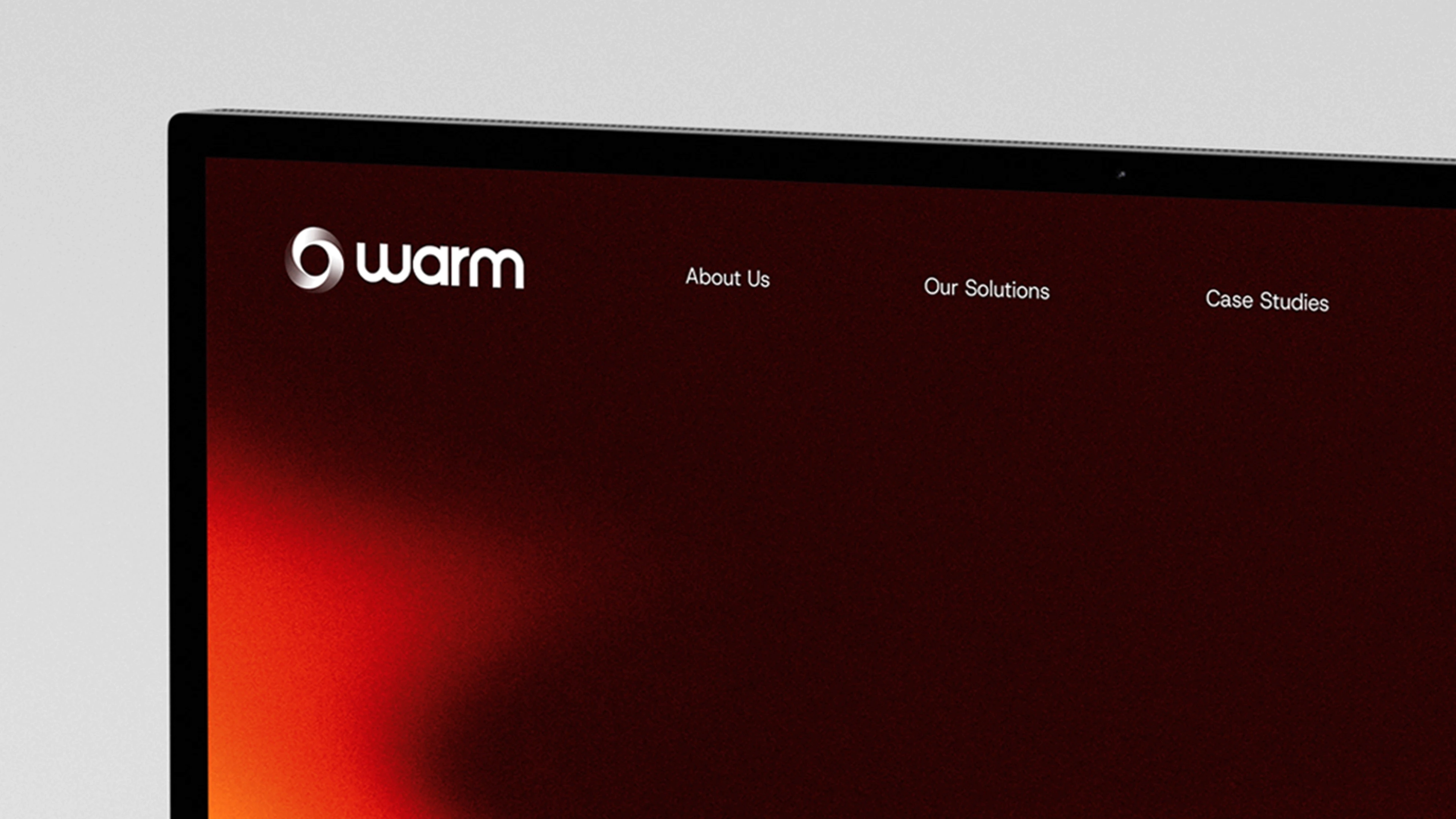
The new identity focused on clarity and restraint. A refined logotype established a stronger, more confident presence, while typography and colour were selected to feel contemporary yet grounded.
Consistency was central to the system. I developed clear visual rules around hierarchy, spacing and tone to ensure the brand could scale across environments without losing coherence.
Photography guidance supported this direction, favouring natural, authentic imagery over generic corporate visuals, helping the brand feel more human and approachable.
ROLE & DELIVERABLES
ROLE & Deliverables
My Role
Lead Designer
I led the brand identity development from concept through to rollout, shaping the visual direction and system.
Brand identity & logo refinement
Visual system & colour palette
Typography selection
Motion & interaction design
Art direction & imagery
UI & layout design
Deliverables
Brand identity development
Logotype design
Colour palette and typographic system
Visual hierarchy and layout framework
Photography guidelines
Brand asset toolkit

OUTCOME
BDDFS now presents itself with clarity and confidence.
The identity reflects the company’s evolution and reinforces its credibility within a competitive financial landscape. The brand feels more structured, consistent and aligned with its advisory-led positioning.
The rebrand provides a solid foundation for future growth, allowing the business to communicate its services with greater clarity and authority.
LEARNINGS
Insights I learned from this project:
This project reinforced the importance of subtlety within professional services branding.
In sectors built on trust, confidence comes from clarity and consistency rather than overstatement. Small refinements in typography, hierarchy and tone can significantly elevate perception.
It also strengthened my ability to modernise without alienating existing audiences — evolving a brand while maintaining credibility.
Preserving and modernising a loved wordmark can anchor a transformation without losing familiarity.
Natural imagery and restrained palettes can humanise technical brands and elevate emotional resonance.
Motion studies, when grounded in design logic, enhance rhythm and user experience without becoming decoration.
BDDFS
Modernising a heritage organisation through identity
Brand & Identity
Web Design
Motion Design

PORTFOLIO
More Projects
More Projects
More Projects
More Projects

BDDFS
Modernising a heritage organisation through identity
Brand & Identity
Web Design
Brand & Identity
Web Design
Motion Design
BDDFS
Modernising a heritage organisation through identity
Brand & Identity
Web Design
Brand & Identity
Web Design
Motion Design
2025
Overview
BDDFS is a financial services firm entering a new chapter. As the business evolved from Business Development Directors into a broader financial services partner, the brand needed to reflect that shift. The identity had to communicate expertise and credibility, while feeling more modern and approachable.
CHALLENGE
The previous identity lacked cohesion and contemporary presence. From logo to typography, the brand felt dated and inconsistent. It didn’t reflect the progressive, advisory-led direction the business was moving toward.
The challenge was to create a visual identity that felt professional and trustworthy, without leaning into overly traditional financial aesthetics. It needed to balance authority with accessibility.
APPROACH
I began by refining the brand’s core positioning, ensuring the visual direction aligned with their expanded role as financial partners rather than transactional service providers.
The new identity focused on clarity and restraint. A refined logotype established a stronger, more confident presence, while typography and colour were selected to feel contemporary yet grounded.
Consistency was central to the system. I developed clear visual rules around hierarchy, spacing and tone to ensure the brand could scale across environments without losing coherence.
Photography guidance supported this direction, favouring natural, authentic imagery over generic corporate visuals, helping the brand feel more human and approachable.
ROLE & DELIVERABLES
My Role
Lead Designer
I led the brand identity development from concept through to rollout, shaping the visual direction and system.
Deliverables
Brand identity development
Logotype design
Colour palette and typographic system
Visual hierarchy and layout framework
Photography guidelines
Brand asset toolkit
OUTCOME
BDDFS now presents itself with clarity and confidence.
The identity reflects the company’s evolution and reinforces its credibility within a competitive financial landscape. The brand feels more structured, consistent and aligned with its advisory-led positioning.
The rebrand provides a solid foundation for future growth, allowing the business to communicate its services with greater clarity and authority.
LEARNINGS
Insights I learned from this project:
This project reinforced the importance of subtlety within professional services branding.
In sectors built on trust, confidence comes from clarity and consistency rather than overstatement. Small refinements in typography, hierarchy and tone can significantly elevate perception.
It also strengthened my ability to modernise without alienating existing audiences — evolving a brand while maintaining credibility.
Preserving and modernising a loved wordmark can anchor a transformation without losing familiarity.
Natural imagery and restrained palettes can humanise technical brands and elevate emotional resonance.
Motion studies, when grounded in design logic, enhance rhythm and user experience without becoming decoration.
BDDFS
Modernising a heritage organisation through identity
Brand & Identity
Web Design
Motion Design
PORTFOLIO
More Projects
More Projects
More Projects

BDDFS
Modernising a heritage organisation through identity
Brand & Identity
Web Design
Brand & Identity
Web Design
Motion Design
BDDFS
Modernising a heritage organisation through identity
Brand & Identity
Web Design
Brand & Identity
Web Design
Motion Design
2025
Overview
BDDFS is a financial services firm entering a new chapter. As the business evolved from Business Development Directors into a broader financial services partner, the brand needed to reflect that shift. The identity had to communicate expertise and credibility, while feeling more modern and approachable.
CHALLENGE
The previous identity lacked cohesion and contemporary presence. From logo to typography, the brand felt dated and inconsistent. It didn’t reflect the progressive, advisory-led direction the business was moving toward.
The challenge was to create a visual identity that felt professional and trustworthy, without leaning into overly traditional financial aesthetics. It needed to balance authority with accessibility.
APPROACH
I began by refining the brand’s core positioning, ensuring the visual direction aligned with their expanded role as financial partners rather than transactional service providers.
The new identity focused on clarity and restraint. A refined logotype established a stronger, more confident presence, while typography and colour were selected to feel contemporary yet grounded.
Consistency was central to the system. I developed clear visual rules around hierarchy, spacing and tone to ensure the brand could scale across environments without losing coherence.
Photography guidance supported this direction, favouring natural, authentic imagery over generic corporate visuals, helping the brand feel more human and approachable.
ROLE & DELIVERABLES
My Role
Lead Designer
I led the brand identity development from concept through to rollout, shaping the visual direction and system.
Deliverables
Brand identity development
Logotype design
Colour palette and typographic system
Visual hierarchy and layout framework
Photography guidelines
Brand asset toolkit
OUTCOME
BDDFS now presents itself with clarity and confidence.
The identity reflects the company’s evolution and reinforces its credibility within a competitive financial landscape. The brand feels more structured, consistent and aligned with its advisory-led positioning.
The rebrand provides a solid foundation for future growth, allowing the business to communicate its services with greater clarity and authority.
LEARNINGS
Insights I learned from this project:
This project reinforced the importance of subtlety within professional services branding.
In sectors built on trust, confidence comes from clarity and consistency rather than overstatement. Small refinements in typography, hierarchy and tone can significantly elevate perception.
It also strengthened my ability to modernise without alienating existing audiences — evolving a brand while maintaining credibility.
Preserving and modernising a loved wordmark can anchor a transformation without losing familiarity.
Natural imagery and restrained palettes can humanise technical brands and elevate emotional resonance.
Motion studies, when grounded in design logic, enhance rhythm and user experience without becoming decoration.
BDDFS
Modernising a heritage organisation through identity
Brand & Identity
Web Design
Motion Design
PORTFOLIO