
BDD Financial Services
A modern identity for a trusted financial partner
Brand & Identity
Web Design
Motion Graphics
2025
2025
2025
OVERVIEW
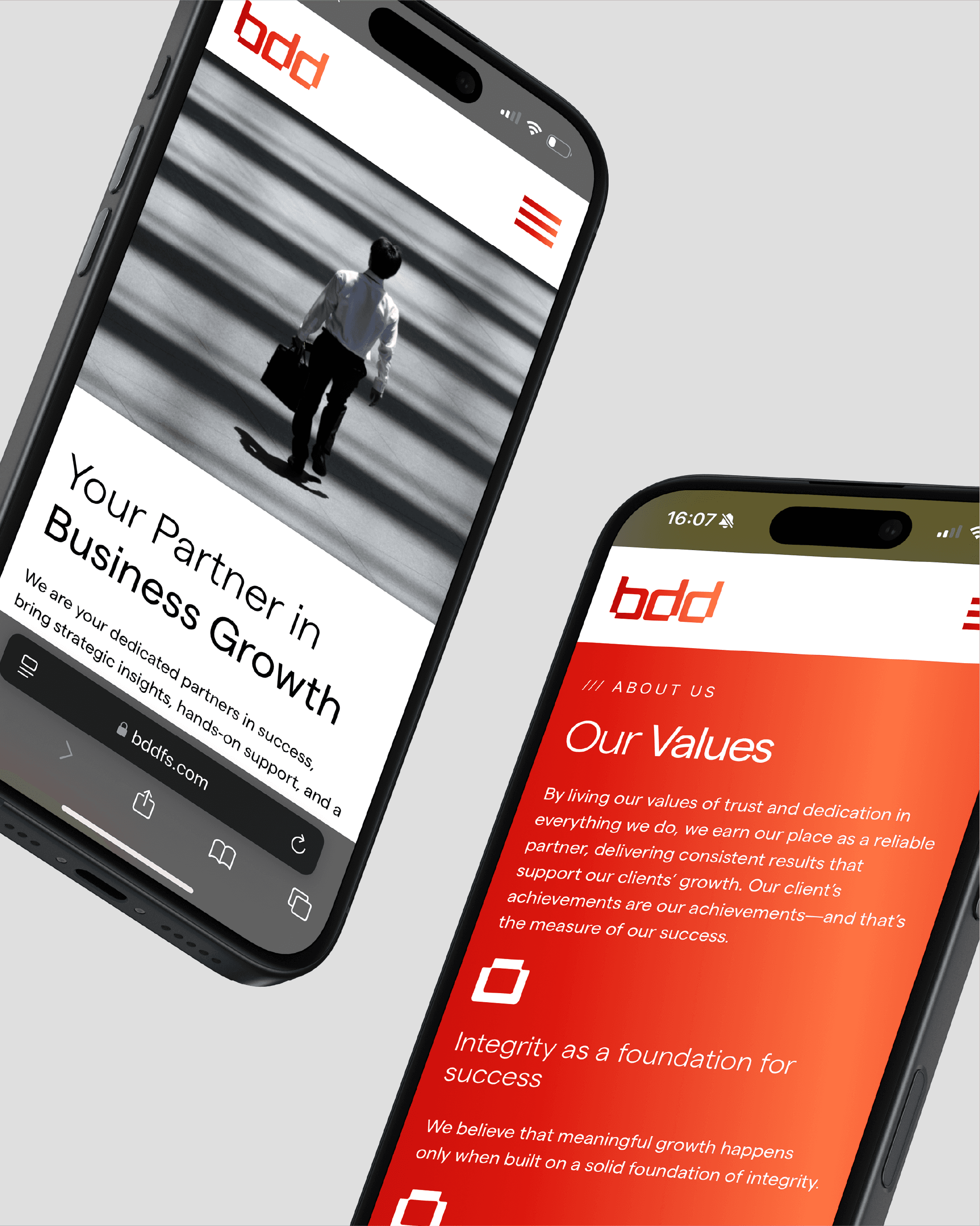
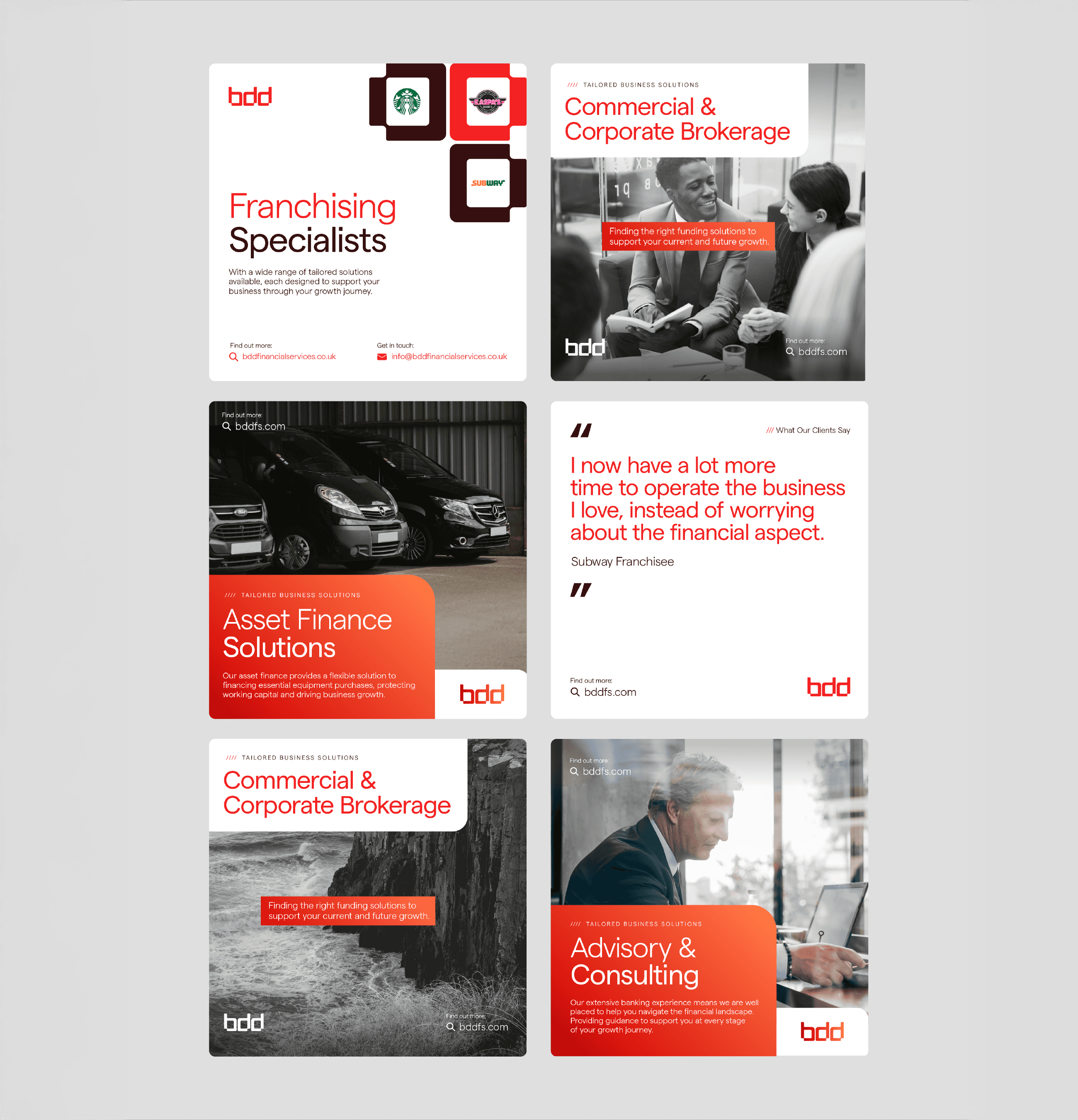
BDD Financial Services were evolving beyond their original remit, shifting from Business Development Directors to a broader role as financial partners and advisors. The challenge was to modernise their identity and design a visual system that felt professional, approachable, and reflective of this expanded focus.

Problem
The previous identity lacked cohesion, clarity and modernity. Heavy gradients, drop shadows and abstract tech motifs obscured the logo’s core form , and the website relied on generic tech aesthetics that no longer reflected Eatron’s sophistication . There was no unified system to express safety, precision or innovation. The challenge was to translate complex battery technology into clear, confident design while preserving the heritage embodied in the original wordmark .
Key challenges:
Minimal brand system with no scalable framework
Rigid website lacking clear navigation and hierarchy
Identity that did not communicate technical capability or seriousness
Role & Scope
My Role
Brand identity & logo refinement
Visual system & colour palette
Typography selection
Motion & interaction design
Art direction & Imagery
UI & Layout design
Brand identity & logo refinement
Visual system & colour palette
Typography selection
Motion & interaction design
Art direction & imagery
UI & layout design
Deliverables
Primary and secondary logomarks
Typography and colour framework
Identity system guidelines
Motion concepts & interaction direction
Curated photography & art direction
Responsive UI design (web)
APPROACH
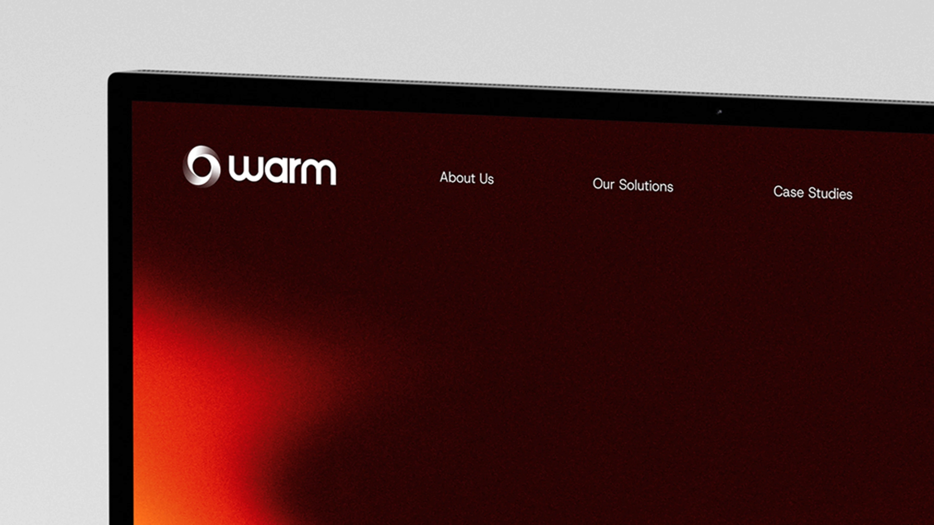
The design process began by reframing heritage. Rather than discarding the original word-mark, I peeled back heavy gradients, drop shadows and the outdated tagline to reveal its core form . This refined logotype was recoloured and decoupled from the brand mark, creating an ethereal, premium aesthetic while maintaining the brand
Typography and colour were chosen to mirror the logo’s forms. Neulis Sans, with letterforms echoing those in the word-mark, provided cohesion across touch-points. A restrained palette and typographic hierarchy created calm and legibility.
Motion was used as a design material rather than decoration. On the web platform subtle transitions, concepted using GSAP and ScrollSmoother, introduced rhythm and precision, enhancing the user experience without distracting from content .
To shift away from generic tech motifs, the art direction focused on the natural world. Large‑scale photography of serene landscapes and natural phenomena highlighted the environmental impact of Eatron’s technology. A softer palette and refined layouts reinforced this connection, reframing the brand as working with nature rather than apart from it.

CRAFT & EXECUTION
Logo & Identity System
Gradient Identity & Visual System
Developed a gradient language using warm hues to convey energy and precision .
Designed a flexible identity system that could scale across digital, motion and print.
Created secondary icons and marks for varied applications.
Typography & Colour
Gradient Identity & Visual System
Paired Host Grotesk with Baj Jamjuree to balance approachability and technical authority .
Defined hierarchy and spacing rules for readability and consistency.
Established a restrained colour palette to support clarity and cohesion.
Motion & Interaction
Gradient Identity & Visual System
Conceptualised motion graphics and subtle animations to give the brand rhythm and depth .
Designed clean entrance animations to guide the eye and improve pacing .
Ensured motion always supported usability and performance .
Art Direction & Imagery
Gradient Identity & Visual System
Created a modular grid system to enable flexible page composition and growth.
Designed navigation and user pathways to guide visitors from arrival to conversion .
Prioritised clear hierarchy and intuitive interaction throughout the site.
The Result
Eatron now owns a refined and cohesive identity that aligns public perception with scientificreality.
The refreshed identity elevated Warm from a single logo to a cohesive brand system.
The new visual system balances heritage with progression, presenting Eatron as a modern, confident and responsible leader in electrification. The website distills complex technology into clear, accessible storytelling and provides an intuitive interface that matches the pace and precision of the company itself.
The gradient language gave the business a distinctive, ownable look , while the interplay of Host Grotesk and Baj Jamjuree created a clear, modern voice. Together, these elements built consistency and confidence, positioning Warm with a brand as dynamic as its offering.
The redesigned website is a platform for growth: it guides users seamlessly through services and drives engagement. Clean animations and motion graphics inject energy and depth without compromising usability. The result is a digital presence that’s modern, conversion‑focused and equipped to support Warm’s future ambitions.
Learning
Insights I learned from this project:
Insights gained from working on this project:
Gradient systems can communicate both dynamism and stability when guided by clear rules.
Pairing typefaces thoughtfully can express both approachability and professionalism.
Motion and subtle interactions should enhance clarity and rhythm, not compete with content.
Preserving and modernising a loved wordmark can anchor a transformation without losing familiarity.
Natural imagery and restrained palettes can humanise technical brands and elevate emotional resonance.
Motion studies, when grounded in design logic, enhance rhythm and user experience without becoming decoration.
The gradient language gave the business a distinctive, ownable look , while the interplay of Host Grotesk and Baj Jamjuree created a clear, modern voice. Together, these elements built consistency and confidence, positioning Warm with a brand as dynamic as its offering.
The redesigned website is a platform for growth: it guides users seamlessly through services and drives engagement. Clean animations and motion graphics inject energy and depth without compromising usability. The result is a digital presence that’s modern, conversion‑focused and equipped to support Warm’s future ambitions.
WARM
Building a digital glow
Brand Refresh
Web Design
PORTFOLIO
More Projects
More Projects
Other Projects


BDD Financial Services
A modern identity for a trusted financial partner
Brand & Identity
Web Design
Motion Graphics
2025
2025
2025
OVERVIEW
BDD Financial Services were evolving beyond their original remit, shifting from Business Development Directors to a broader role as financial partners and advisors. The challenge was to modernise their identity and design a visual system that felt professional, approachable, and reflective of this expanded focus.
Problem
The previous identity lacked cohesion, clarity and modernity. Heavy gradients, drop shadows and abstract tech motifs obscured the logo’s core form , and the website relied on generic tech aesthetics that no longer reflected Eatron’s sophistication . There was no unified system to express safety, precision or innovation. The challenge was to translate complex battery technology into clear, confident design while preserving the heritage embodied in the original wordmark .
Key challenges:
Minimal brand system with no scalable framework
Rigid website lacking clear navigation and hierarchy
Identity that did not communicate technical capability or seriousness
Role & Scope
My Role
Brand identity & logo refinement
Visual system & colour palette
Typography selection
Motion & interaction design
Art direction & Imagery
UI & Layout design
Deliverables
Primary and secondary logomarks
Typography and colour framework
Identity system guidelines
Motion concepts & interaction direction
Curated photography & art direction
Responsive UI design (web)
APPROACH
The design process began by reframing heritage. Rather than discarding the original word-mark, I peeled back heavy gradients, drop shadows and the outdated tagline to reveal its core form . This refined logotype was recoloured and decoupled from the brand mark, creating an ethereal, premium aesthetic while maintaining the brand
Typography and colour were chosen to mirror the logo’s forms. Neulis Sans, with letterforms echoing those in the word-mark, provided cohesion across touch-points. A restrained palette and typographic hierarchy created calm and legibility.
Motion was used as a design material rather than decoration. On the web platform subtle transitions, concepted using GSAP and ScrollSmoother, introduced rhythm and precision, enhancing the user experience without distracting from content .
To shift away from generic tech motifs, the art direction focused on the natural world. Large‑scale photography of serene landscapes and natural phenomena highlighted the environmental impact of Eatron’s technology. A softer palette and refined layouts reinforced this connection, reframing the brand as working with nature rather than apart from it.
CRAFT & EXECUTION
Logo & Identity System
Developed a gradient language using warm hues to convey energy and precision .
Designed a flexible identity system that could scale across digital, motion and print.
Created secondary icons and marks for varied applications.
Typography & Colour
Paired Host Grotesk with Baj Jamjuree to balance approachability and technical authority .
Defined hierarchy and spacing rules for readability and consistency.
Established a restrained colour palette to support clarity and cohesion.
Motion & Interaction
Conceptualised motion graphics and subtle animations to give the brand rhythm and depth .
Designed clean entrance animations to guide the eye and improve pacing .
Ensured motion always supported usability and performance .
Art Direction & Imagery
Created a modular grid system to enable flexible page composition and growth.
Designed navigation and user pathways to guide visitors from arrival to conversion .
Prioritised clear hierarchy and intuitive interaction throughout the site.
The Result
The refreshed identity elevated Warm from a single logo to a cohesive brand system.
The gradient language gave the business a distinctive, ownable look , while the interplay of Host Grotesk and Baj Jamjuree created a clear, modern voice. Together, these elements built consistency and confidence, positioning Warm with a brand as dynamic as its offering.
The redesigned website is a platform for growth: it guides users seamlessly through services and drives engagement. Clean animations and motion graphics inject energy and depth without compromising usability. The result is a digital presence that’s modern, conversion‑focused and equipped to support Warm’s future ambitions.
Learning
Insights gained from working on this project:
Gradient systems can communicate both dynamism and stability when guided by clear rules.
Pairing typefaces thoughtfully can express both approachability and professionalism.
Motion and subtle interactions should enhance clarity and rhythm, not compete with content.
The gradient language gave the business a distinctive, ownable look , while the interplay of Host Grotesk and Baj Jamjuree created a clear, modern voice. Together, these elements built consistency and confidence, positioning Warm with a brand as dynamic as its offering.
The redesigned website is a platform for growth: it guides users seamlessly through services and drives engagement. Clean animations and motion graphics inject energy and depth without compromising usability. The result is a digital presence that’s modern, conversion‑focused and equipped to support Warm’s future ambitions.
WARM
Building a digital glow
Brand Refresh
Web Design
PORTFOLIO
More Projects
More Projects
Other Projects

BDD Financial Services
A modern identity for a trusted financial partner
Brand & Identity
Web Design
Motion Graphics
2025
2025
2025
OVERVIEW
BDD Financial Services were evolving beyond their original remit, shifting from Business Development Directors to a broader role as financial partners and advisors. The challenge was to modernise their identity and design a visual system that felt professional, approachable, and reflective of this expanded focus.
Problem
The previous identity lacked cohesion, clarity and modernity. Heavy gradients, drop shadows and abstract tech motifs obscured the logo’s core form , and the website relied on generic tech aesthetics that no longer reflected Eatron’s sophistication . There was no unified system to express safety, precision or innovation. The challenge was to translate complex battery technology into clear, confident design while preserving the heritage embodied in the original wordmark .
Key challenges:
Minimal brand system with no scalable framework
Rigid website lacking clear navigation and hierarchy
Identity that did not communicate technical capability or seriousness
Role & Scope
My Role
Brand identity & logo refinement
Visual system & colour palette
Typography selection
Motion & interaction design
Art direction & Imagery
UI & Layout design
Deliverables
Primary and secondary logomarks
Typography and colour framework
Identity system guidelines
Motion concepts & interaction direction
Curated photography & art direction
Responsive UI design (web)
APPROACH
The design process began by reframing heritage. Rather than discarding the original word-mark, I peeled back heavy gradients, drop shadows and the outdated tagline to reveal its core form . This refined logotype was recoloured and decoupled from the brand mark, creating an ethereal, premium aesthetic while maintaining the brand
Typography and colour were chosen to mirror the logo’s forms. Neulis Sans, with letterforms echoing those in the word-mark, provided cohesion across touch-points. A restrained palette and typographic hierarchy created calm and legibility.
Motion was used as a design material rather than decoration. On the web platform subtle transitions, concepted using GSAP and ScrollSmoother, introduced rhythm and precision, enhancing the user experience without distracting from content .
To shift away from generic tech motifs, the art direction focused on the natural world. Large‑scale photography of serene landscapes and natural phenomena highlighted the environmental impact of Eatron’s technology. A softer palette and refined layouts reinforced this connection, reframing the brand as working with nature rather than apart from it.
CRAFT & EXECUTION
Logo & Identity System
Developed a gradient language using warm hues to convey energy and precision .
Designed a flexible identity system that could scale across digital, motion and print.
Created secondary icons and marks for varied applications.
Typography & Colour
Paired Host Grotesk with Baj Jamjuree to balance approachability and technical authority .
Defined hierarchy and spacing rules for readability and consistency.
Established a restrained colour palette to support clarity and cohesion.
Motion & Interaction
Conceptualised motion graphics and subtle animations to give the brand rhythm and depth .
Designed clean entrance animations to guide the eye and improve pacing .
Ensured motion always supported usability and performance .
Art Direction & Imagery
Created a modular grid system to enable flexible page composition and growth.
Designed navigation and user pathways to guide visitors from arrival to conversion .
Prioritised clear hierarchy and intuitive interaction throughout the site.
The Result
Eatron now owns a refined and cohesive identity that aligns public perception with scientificreality.
The new visual system balances heritage with progression, presenting Eatron as a modern, confident and responsible leader in electrification. The website distills complex technology into clear, accessible storytelling and provides an intuitive interface that matches the pace and precision of the company itself.
Learning
Insights I learned from this project:
Preserving and modernising a loved wordmark can anchor a transformation without losing familiarity.
Natural imagery and restrained palettes can humanise technical brands and elevate emotional resonance.
Motion studies, when grounded in design logic, enhance rhythm and user experience without becoming decoration.
WARM
Building a digital glow
Brand Refresh
Web Design
PORTFOLIO