
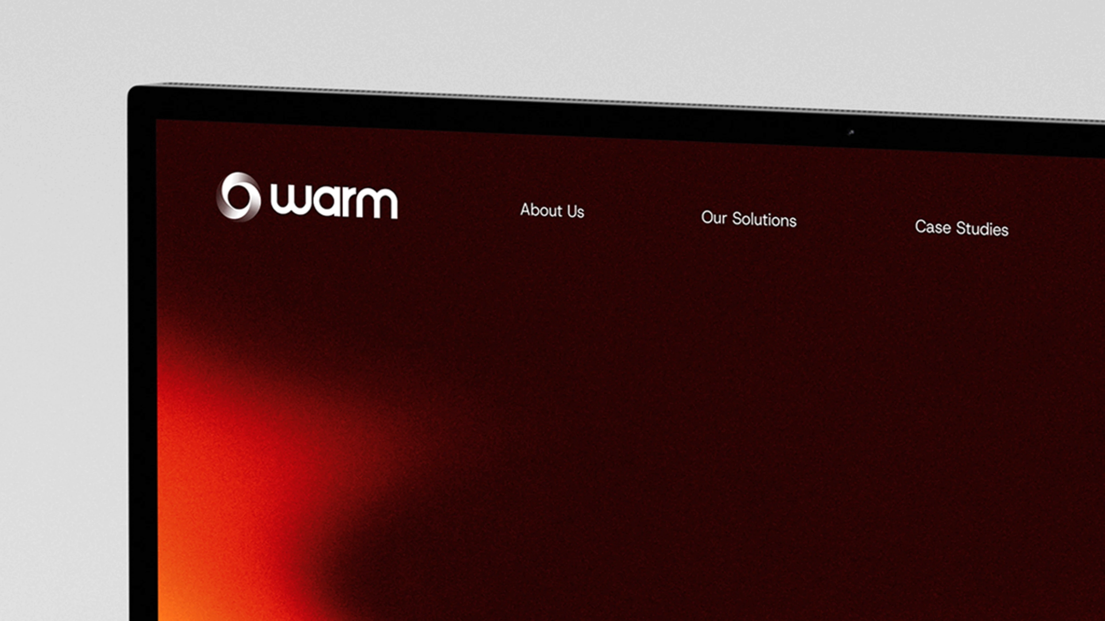
WARM
Building a digital glow
Brand & Identity
Web Design
Motion Graphics
2024
2024
2024
Know More
WARM needed a brand and digital identity that reflected their technical expertise and growth ambitions. The brief was to reimagine the brand from the ground up, crafting a flexible identity and an intuitive digital experience that communicated both energy and precision.

Visual Identity
The existing brand relied on a single logo and abstract tech motifs, offering little in the way of structure or warmth. Navigation and UX issues hampered the user journey , while a lack of flexible design elements limited how the brand could be expressed. WARM needed to elevate their identity and create a digital platform that guided visitors effectively, reflecting the company’s momentum and confidence.
Key challenges:
Minimal brand system with no scalable framework
Rigid website lacking clear navigation and hierarchy
Identity that did not communicate technical capability or seriousness
In today’s fast-paced, technology-driven world, the connection between humans and nature has been severely eroded. Urban sprawl, pollution, and the demands of modern life have left little room for the tranquility and inspiration that natural landscapes once provided. People are increasingly feeling disconnected from the outdoors, leading to stress, burnout, and a longing for spaces that offer peace and rejuvenation. The magic of untouched meadows, serene forests, and vibrant ecosystems is fading, replaced by concrete jungles and digital distractions. This disconnect not only impacts mental and physical well-being but also diminishes our appreciation for the environment. Mystic Meadows aims to bridge this gap, rekindling the lost bond between humanity and the natural world.
Solution
I was the sole designer on this project, completing:
Brand identity refresh & visual system
Gradient language & colour palette
Typography selection
Motion graphics & interaction design
UI & layout design
Creative direction for video & digital assets
Brand identity & logo refinement
Visual system & colour palette
Typography selection
Motion & interaction design
Art direction & imagery
UI & layout design
Deliverables
Primary brand marks & secondary icons
Typography and colour guidelines
Motion studies & animated assets
Responsive UI design (web)
Digital and launch video collateral

APPROACH
The brand refresh began with a colour‑driven identity. A gradient system built on warm hues became the core of the visual language, communicating energy and precision across digital, motion and large‑format applications. Typography played a crucial role: the sans-serif Host Grotesk provided a clean, approachable base, while Baj Jamjuree added technical weight. Together they formed a modern voice that balanced professionalism with technical profiency
For the digital platform, the website was rebuilt around user‑centred navigation and a modular design framework. Motion graphics, crafted video content and subtle interactions brought the brand to life online. Clean entrance animations for key text added rhythm and clarity, while refined layouts ensured flexibility and growth.
CRAFT & EXECUTION
Logo & Identity System
Typography & Colour
Motion & Interaction
Art Direction & Imagery
The Result
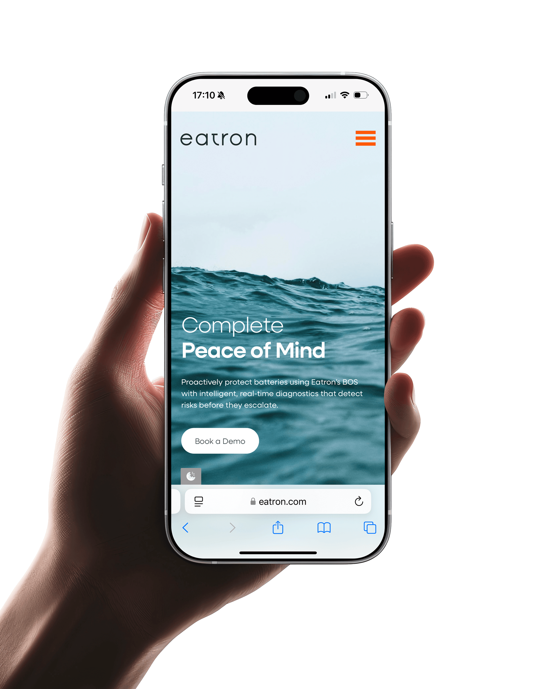
Eatron now owns a refined and cohesive identity that aligns public perception with scientificreality.
The new visual system balances heritage with progression, presenting Eatron as a modern, confident and responsible leader in electrification. The website distills complex technology into clear, accessible storytelling and provides an intuitive interface that matches the pace and precision of the company itself.
Learning
Insights I learned from this project:
Preserving and modernising a loved wordmark can anchor a transformation without losing familiarity.
Natural imagery and restrained palettes can humanise technical brands and elevate emotional resonance.
Motion studies, when grounded in design logic, enhance rhythm and user experience without becoming decoration.
Physio.je
Previously known as Performance Physio, the team approached me to reposition the brand and better reflect their people-first approach to physiotherapy. The aim was to reach beyond elite athletes and speak to a wider Jersey audience — including everyday patients and specialised services.
I led a full rebrand and launch campaign, delivering a new identity, website, and brand film that reflect their evolution and ambition.
Brand & Identity
Web DEsign
PORTFOLIO
More Projects
More Projects
Other Projects


WARM
Building a digital glow
Brand & Identity
Web Design
Motion Graphics
2024
2024
2024
Know More
WARM needed a brand and digital identity that reflected their technical expertise and growth ambitions. The brief was to reimagine the brand from the ground up, crafting a flexible identity and an intuitive digital experience that communicated both energy and precision.
Visual Identity
The existing brand relied on a single logo and abstract tech motifs, offering little in the way of structure or warmth. Navigation and UX issues hampered the user journey , while a lack of flexible design elements limited how the brand could be expressed. WARM needed to elevate their identity and create a digital platform that guided visitors effectively, reflecting the company’s momentum and confidence.
Key challenges:
Minimal brand system with no scalable framework
Rigid website lacking clear navigation and hierarchy
Identity that did not communicate technical capability or seriousness
In today’s fast-paced, technology-driven world, the connection between humans and nature has been severely eroded. Urban sprawl, pollution, and the demands of modern life have left little room for the tranquility and inspiration that natural landscapes once provided. People are increasingly feeling disconnected from the outdoors, leading to stress, burnout, and a longing for spaces that offer peace and rejuvenation. The magic of untouched meadows, serene forests, and vibrant ecosystems is fading, replaced by concrete jungles and digital distractions. This disconnect not only impacts mental and physical well-being but also diminishes our appreciation for the environment. Mystic Meadows aims to bridge this gap, rekindling the lost bond between humanity and the natural world.
Solution
I was the sole designer on this project, completing:
Brand identity refresh & visual system
Gradient language & colour palette
Typography selection
Motion graphics & interaction design
UI & layout design
Creative direction for video & digital assets
Deliverables
Primary brand marks & secondary icons
Typography and colour guidelines
Motion studies & animated assets
Responsive UI design (web)
Digital and launch video collateral
APPROACH
The brand refresh began with a colour‑driven identity. A gradient system built on warm hues became the core of the visual language, communicating energy and precision across digital, motion and large‑format applications. Typography played a crucial role: the sans-serif Host Grotesk provided a clean, approachable base, while Baj Jamjuree added technical weight. Together they formed a modern voice that balanced professionalism with technical profiency
For the digital platform, the website was rebuilt around user‑centred navigation and a modular design framework. Motion graphics, crafted video content and subtle interactions brought the brand to life online. Clean entrance animations for key text added rhythm and clarity, while refined layouts ensured flexibility and growth.
CRAFT & EXECUTION
Logo & Identity System
Typography & Colour
Motion & Interaction
Art Direction & Imagery
The Result
Learning
Insights I learned from this project:
Physio.je
Previously known as Performance Physio, the team approached me to reposition the brand and better reflect their people-first approach to physiotherapy. The aim was to reach beyond elite athletes and speak to a wider Jersey audience — including everyday patients and specialised services.
I led a full rebrand and launch campaign, delivering a new identity, website, and brand film that reflect their evolution and ambition.
Brand & Identity
Web DEsign
PORTFOLIO
More Projects
More Projects
Other Projects
WARM
Building a digital glow
Brand & Identity
Web Design
Motion Graphics
2024
2024
2024
Know More
WARM needed a brand and digital identity that reflected their technical expertise and growth ambitions. The brief was to reimagine the brand from the ground up, crafting a flexible identity and an intuitive digital experience that communicated both energy and precision.
Visual Identity
The existing brand relied on a single logo and abstract tech motifs, offering little in the way of structure or warmth. Navigation and UX issues hampered the user journey , while a lack of flexible design elements limited how the brand could be expressed. WARM needed to elevate their identity and create a digital platform that guided visitors effectively, reflecting the company’s momentum and confidence.
Key challenges:
Minimal brand system with no scalable framework
Rigid website lacking clear navigation and hierarchy
Identity that did not communicate technical capability or seriousness
In today’s fast-paced, technology-driven world, the connection between humans and nature has been severely eroded. Urban sprawl, pollution, and the demands of modern life have left little room for the tranquility and inspiration that natural landscapes once provided. People are increasingly feeling disconnected from the outdoors, leading to stress, burnout, and a longing for spaces that offer peace and rejuvenation. The magic of untouched meadows, serene forests, and vibrant ecosystems is fading, replaced by concrete jungles and digital distractions. This disconnect not only impacts mental and physical well-being but also diminishes our appreciation for the environment. Mystic Meadows aims to bridge this gap, rekindling the lost bond between humanity and the natural world.
Solution
I was the sole designer on this project, completing:
Brand identity refresh & visual system
Gradient language & colour palette
Typography selection
Motion graphics & interaction design
UI & layout design
Creative direction for video & digital assets
Deliverables
Primary brand marks & secondary icons
Typography and colour guidelines
Motion studies & animated assets
Responsive UI design (web)
Digital and launch video collateral
APPROACH
The brand refresh began with a colour‑driven identity. A gradient system built on warm hues became the core of the visual language, communicating energy and precision across digital, motion and large‑format applications. Typography played a crucial role: the sans-serif Host Grotesk provided a clean, approachable base, while Baj Jamjuree added technical weight. Together they formed a modern voice that balanced professionalism with technical profiency
For the digital platform, the website was rebuilt around user‑centred navigation and a modular design framework. Motion graphics, crafted video content and subtle interactions brought the brand to life online. Clean entrance animations for key text added rhythm and clarity, while refined layouts ensured flexibility and growth.
CRAFT & EXECUTION
Logo & Identity System
Typography & Colour
Motion & Interaction
Art Direction & Imagery
The Result
Eatron now owns a refined and cohesive identity that aligns public perception with scientificreality.
The new visual system balances heritage with progression, presenting Eatron as a modern, confident and responsible leader in electrification. The website distills complex technology into clear, accessible storytelling and provides an intuitive interface that matches the pace and precision of the company itself.
Learning
Insights I learned from this project:
Preserving and modernising a loved wordmark can anchor a transformation without losing familiarity.
Natural imagery and restrained palettes can humanise technical brands and elevate emotional resonance.
Motion studies, when grounded in design logic, enhance rhythm and user experience without becoming decoration.
Physio.je
Previously known as Performance Physio, the team approached me to reposition the brand and better reflect their people-first approach to physiotherapy. The aim was to reach beyond elite athletes and speak to a wider Jersey audience — including everyday patients and specialised services.
I led a full rebrand and launch campaign, delivering a new identity, website, and brand film that reflect their evolution and ambition.
Brand & Identity
Web DEsign
PORTFOLIO