
BDD Financial Services
A modern identity for a trusted financial partner
Brand & Identity
Web Design
Motion Graphics
2025
2025
2025
Overview
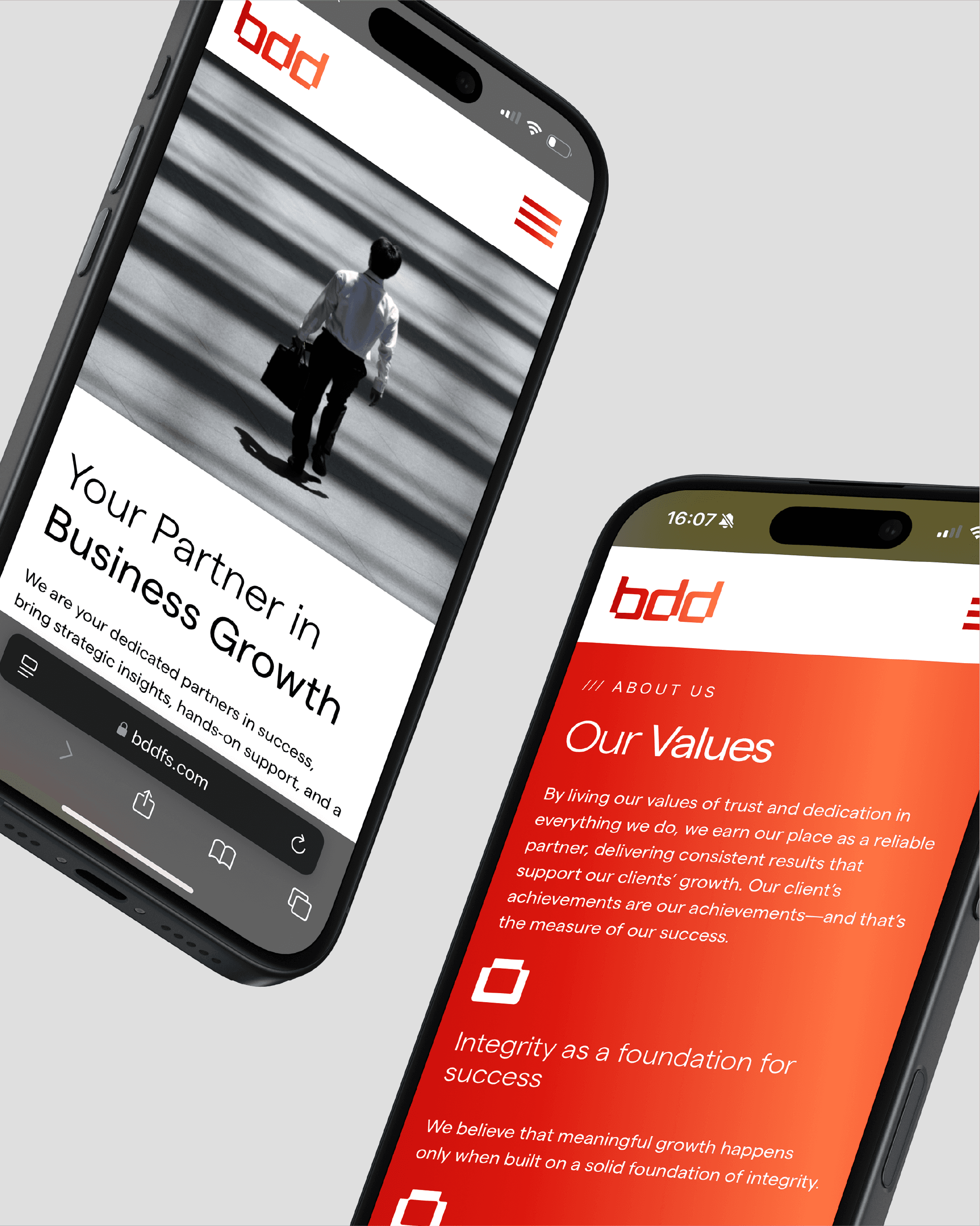
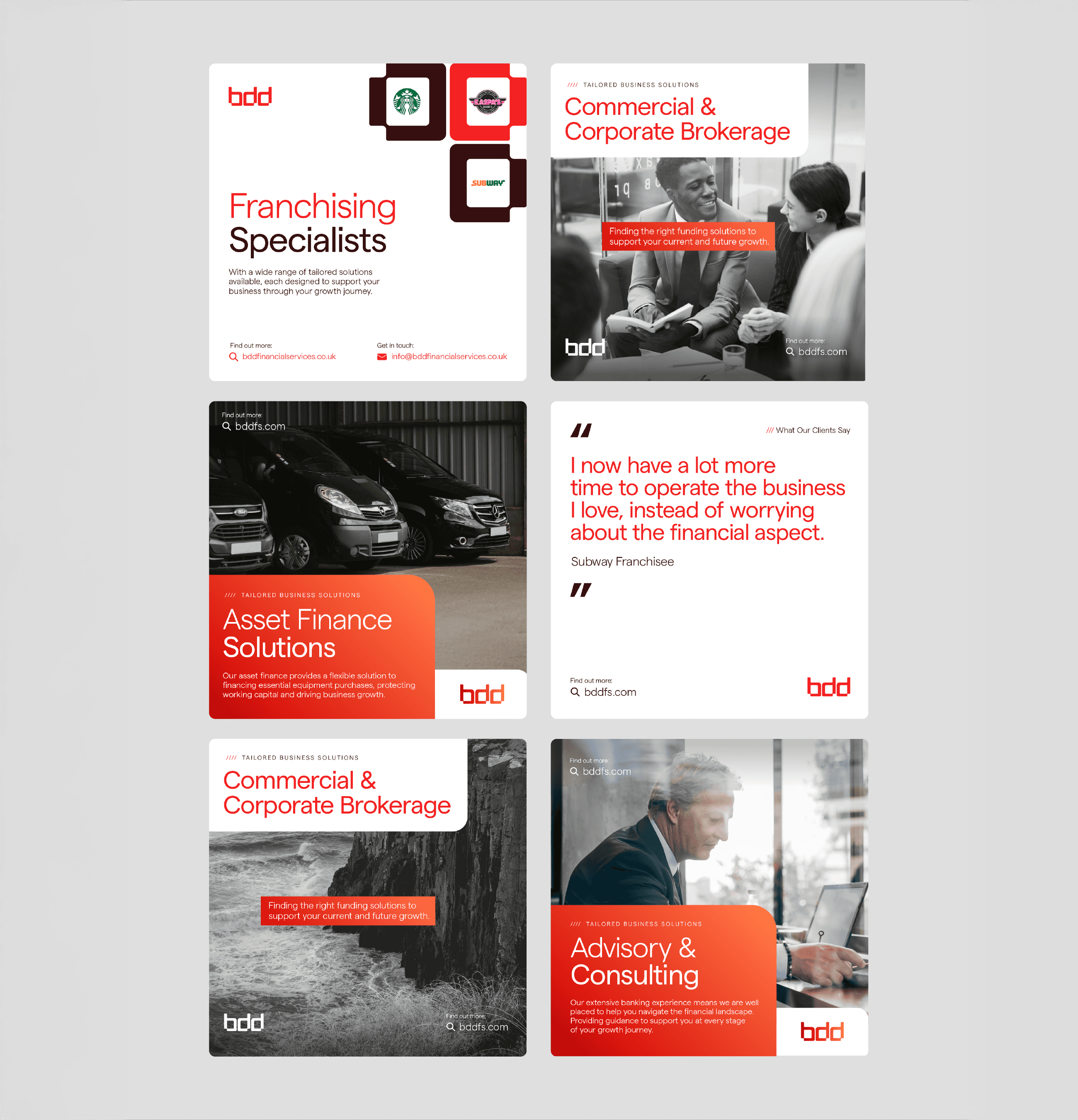
BDD Financial Services were evolving beyond their original remit, shifting from Business Development Directors to a broader role as financial partners and advisors. The challenge was to modernise their identity and design a visual system that felt professional, approachable, and reflective of this expanded focus.

Problem
The previous identity lacked cohesion, clarity and modernity. Heavy gradients, drop shadows and abstract tech motifs obscured the logo’s core form , and the website relied on generic tech aesthetics that no longer reflected Eatron’s sophistication . There was no unified system to express safety, precision or innovation. The challenge was to translate complex battery technology into clear, confident design while preserving the heritage embodied in the original wordmark .
Role & Scope
My Role
Brand identity & logo refinement
Visual system & colour palette
Typography selection
Motion & interaction design
Art direction & Imagery
UI & Layout design
Brand identity & logo refinement
Visual system & colour palette
Typography selection
Motion & interaction design
Art direction & imagery
UI & layout design
Deliverables
Primary and secondary logomarks
Typography and colour framework
Identity system guidelines
Motion concepts & interaction direction
Curated photography & art direction
Responsive UI design (web)
APPROACH
The design process began by reframing heritage. Rather than discarding the original word-mark, I peeled back heavy gradients, drop shadows and the outdated tagline to reveal its core form . This refined logotype was recoloured and decoupled from the brand mark, creating an ethereal, premium aesthetic while maintaining the brand
Typography and colour were chosen to mirror the logo’s forms. Neulis Sans, with letterforms echoing those in the word-mark, provided cohesion across touch-points. A restrained palette and typographic hierarchy created calm and legibility.
Motion was used as a design material rather than decoration. On the web platform subtle transitions, concepted using GSAP and ScrollSmoother, introduced rhythm and precision, enhancing the user experience without distracting from content .
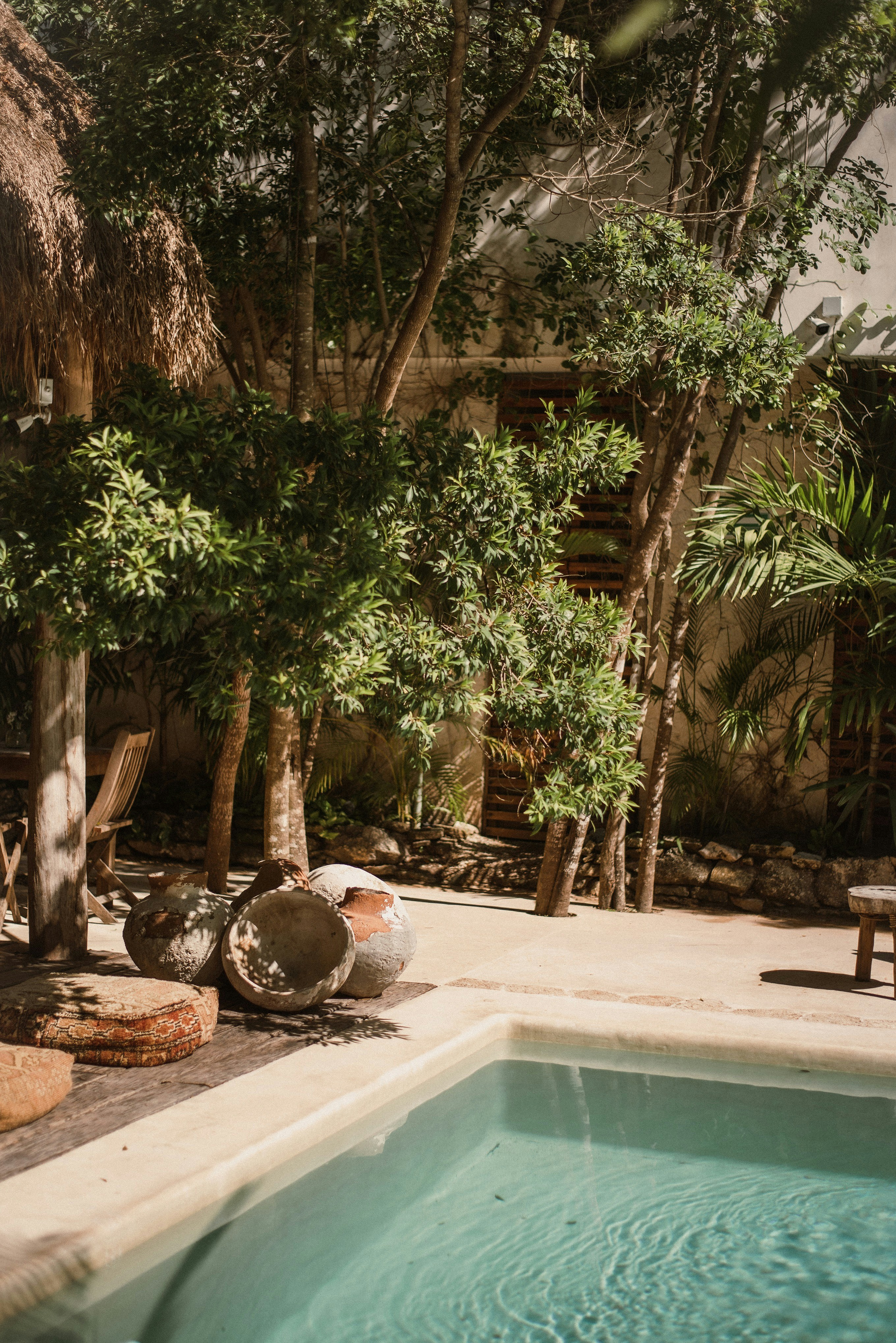
To shift away from generic tech motifs, the art direction focused on the natural world. Large‑scale photography of serene landscapes and natural phenomena highlighted the environmental impact of Eatron’s technology. A softer palette and refined layouts reinforced this connection, reframing the brand as working with nature rather than apart from it.
Key to this was establishing a sense of calm. I explored ways to translate the ethos of “less faff, more flow” into every element of the brand. We knew the identity had to stand apart from competitors, so I worked on a bespoke mark that feels both modern and approachable. To humanise the technology, the visual direction leaned into genuine human moments and thoughtful composition. At the same time, the interface framework needed to be simple and intuitive, so that users could navigate without friction.

CRAFT & EXECUTION
Logo & Identity System
Identity & Logo
Designed a distinctive mark that feels modern and approachable, giving Bouk a recognisable presence.
Established clear usage rules to ensure consistency across print and digital.
Typography & Colour
Identity & Logo
Implemented Aeonik for primary headers and Inter for body copy. This pairing supports clarity across screen sizes and content types.
Built a colour system featuring warm neutrals and strategic accents, ensuring a calm foundation with hints of energy and precision where needed.
Created a hierarchy for headings, subheadings and text to guide users through the interface.
Motion & Interaction
Identity & Logo
Directed imagery to be calm, modern and human: soft light, natural tones and thoughtful composition.
Chose real users and environments to convey authenticity and warmth, aligning with Bouk’s ethos.
Created composition and cropping guidelines to keep the visual language consistent.
Art Direction & Imagery
Identity & Logo
Built modular UI components, including navigation, buttons and cards, that can adapt to persona‑specific funnels and campaigns.
Designed flows around clarity and ease of use, ensuring that each action feels intuitive and stress‑free.
Used unconventional text layouts to separate bouk from its competitors
The result
Eatron now owns a refined and cohesive identity that aligns public perception with scientificreality.
The new Bouk identity transforms the brand from a functional booking tool into an inviting, modern platform.
The new visual system balances heritage with progression, presenting Eatron as a modern, confident and responsible leader in electrification. The website distills complex technology into clear, accessible storytelling and provides an intuitive interface that matches the pace and precision of the company itself.
The stylised logo offers distinction, the UI system brings clarity and ease of use, and the photography and colour palette humanise the technology. Together, these elements communicate Bouk’s promise of effortless bookings and support its goal of helping businesses focus on delivering great experiences.
Learning
Insights I learned from this project:
Creating Bouk’s new identity reinforced the importance of aligning design with brand values. A cohesive logo, type system and colour palette set the tone, while authentic imagery and intuitive UI design bring warmth and clarity. Designing for calm and simplicity can transform a utilitarian product into an inviting partner that frees users to focus on what matters.
Preserving and modernising a loved wordmark can anchor a transformation without losing familiarity.
Natural imagery and restrained palettes can humanise technical brands and elevate emotional resonance.
Motion studies, when grounded in design logic, enhance rhythm and user experience without becoming decoration.
The stylised logo offers distinction, the UI system brings clarity and ease of use, and the photography and colour palette humanise the technology. Together, these elements communicate Bouk’s promise of effortless bookings and support its goal of helping businesses focus on delivering great experiences.
bouk
Effortless by design
Brand Identity
UI & Motion Design
PORTFOLIO
More Projects
More Projects
Other Projects


BDD Financial Services
A modern identity for a trusted financial partner
Brand & Identity
Web Design
Motion Graphics
2025
2025
2025
Overview
BDD Financial Services were evolving beyond their original remit, shifting from Business Development Directors to a broader role as financial partners and advisors. The challenge was to modernise their identity and design a visual system that felt professional, approachable, and reflective of this expanded focus.
Problem
The previous identity lacked cohesion, clarity and modernity. Heavy gradients, drop shadows and abstract tech motifs obscured the logo’s core form , and the website relied on generic tech aesthetics that no longer reflected Eatron’s sophistication . There was no unified system to express safety, precision or innovation. The challenge was to translate complex battery technology into clear, confident design while preserving the heritage embodied in the original wordmark .
Role & Scope
My Role
Brand identity & logo refinement
Visual system & colour palette
Typography selection
Motion & interaction design
Art direction & Imagery
UI & Layout design
Deliverables
Primary and secondary logomarks
Typography and colour framework
Identity system guidelines
Motion concepts & interaction direction
Curated photography & art direction
Responsive UI design (web)
APPROACH
The design process began by reframing heritage. Rather than discarding the original word-mark, I peeled back heavy gradients, drop shadows and the outdated tagline to reveal its core form . This refined logotype was recoloured and decoupled from the brand mark, creating an ethereal, premium aesthetic while maintaining the brand
Typography and colour were chosen to mirror the logo’s forms. Neulis Sans, with letterforms echoing those in the word-mark, provided cohesion across touch-points. A restrained palette and typographic hierarchy created calm and legibility.
Motion was used as a design material rather than decoration. On the web platform subtle transitions, concepted using GSAP and ScrollSmoother, introduced rhythm and precision, enhancing the user experience without distracting from content .
To shift away from generic tech motifs, the art direction focused on the natural world. Large‑scale photography of serene landscapes and natural phenomena highlighted the environmental impact of Eatron’s technology. A softer palette and refined layouts reinforced this connection, reframing the brand as working with nature rather than apart from it.
Key to this was establishing a sense of calm. I explored ways to translate the ethos of “less faff, more flow” into every element of the brand. We knew the identity had to stand apart from competitors, so I worked on a bespoke mark that feels both modern and approachable. To humanise the technology, the visual direction leaned into genuine human moments and thoughtful composition. At the same time, the interface framework needed to be simple and intuitive, so that users could navigate without friction.
CRAFT & EXECUTION
Logo & Identity System
Designed a distinctive mark that feels modern and approachable, giving Bouk a recognisable presence.
Established clear usage rules to ensure consistency across print and digital.
Typography & Colour
Implemented Aeonik for primary headers and Inter for body copy. This pairing supports clarity across screen sizes and content types.
Built a colour system featuring warm neutrals and strategic accents, ensuring a calm foundation with hints of energy and precision where needed.
Created a hierarchy for headings, subheadings and text to guide users through the interface.
Motion & Interaction
Directed imagery to be calm, modern and human: soft light, natural tones and thoughtful composition.
Chose real users and environments to convey authenticity and warmth, aligning with Bouk’s ethos.
Created composition and cropping guidelines to keep the visual language consistent.
Art Direction & Imagery
Built modular UI components, including navigation, buttons and cards, that can adapt to persona‑specific funnels and campaigns.
Designed flows around clarity and ease of use, ensuring that each action feels intuitive and stress‑free.
Used unconventional text layouts to separate bouk from its competitors
The result
The new Bouk identity transforms the brand from a functional booking tool into an inviting, modern platform.
The stylised logo offers distinction, the UI system brings clarity and ease of use, and the photography and colour palette humanise the technology. Together, these elements communicate Bouk’s promise of effortless bookings and support its goal of helping businesses focus on delivering great experiences.
Learning
Creating Bouk’s new identity reinforced the importance of aligning design with brand values. A cohesive logo, type system and colour palette set the tone, while authentic imagery and intuitive UI design bring warmth and clarity. Designing for calm and simplicity can transform a utilitarian product into an inviting partner that frees users to focus on what matters.
The stylised logo offers distinction, the UI system brings clarity and ease of use, and the photography and colour palette humanise the technology. Together, these elements communicate Bouk’s promise of effortless bookings and support its goal of helping businesses focus on delivering great experiences.
bouk
Effortless by design
Brand Identity
UI & Motion Design
PORTFOLIO
More Projects
More Projects
Other Projects

BDD Financial Services
A modern identity for a trusted financial partner
Brand & Identity
Web Design
Motion Graphics
2025
2025
2025
Overview
BDD Financial Services were evolving beyond their original remit, shifting from Business Development Directors to a broader role as financial partners and advisors. The challenge was to modernise their identity and design a visual system that felt professional, approachable, and reflective of this expanded focus.
Problem
The previous identity lacked cohesion, clarity and modernity. Heavy gradients, drop shadows and abstract tech motifs obscured the logo’s core form , and the website relied on generic tech aesthetics that no longer reflected Eatron’s sophistication . There was no unified system to express safety, precision or innovation. The challenge was to translate complex battery technology into clear, confident design while preserving the heritage embodied in the original wordmark .
Role & Scope
My Role
Brand identity & logo refinement
Visual system & colour palette
Typography selection
Motion & interaction design
Art direction & Imagery
UI & Layout design
Deliverables
Primary and secondary logomarks
Typography and colour framework
Identity system guidelines
Motion concepts & interaction direction
Curated photography & art direction
Responsive UI design (web)
APPROACH
The design process began by reframing heritage. Rather than discarding the original word-mark, I peeled back heavy gradients, drop shadows and the outdated tagline to reveal its core form . This refined logotype was recoloured and decoupled from the brand mark, creating an ethereal, premium aesthetic while maintaining the brand
Typography and colour were chosen to mirror the logo’s forms. Neulis Sans, with letterforms echoing those in the word-mark, provided cohesion across touch-points. A restrained palette and typographic hierarchy created calm and legibility.
Motion was used as a design material rather than decoration. On the web platform subtle transitions, concepted using GSAP and ScrollSmoother, introduced rhythm and precision, enhancing the user experience without distracting from content .
To shift away from generic tech motifs, the art direction focused on the natural world. Large‑scale photography of serene landscapes and natural phenomena highlighted the environmental impact of Eatron’s technology. A softer palette and refined layouts reinforced this connection, reframing the brand as working with nature rather than apart from it.
Key to this was establishing a sense of calm. I explored ways to translate the ethos of “less faff, more flow” into every element of the brand. We knew the identity had to stand apart from competitors, so I worked on a bespoke mark that feels both modern and approachable. To humanise the technology, the visual direction leaned into genuine human moments and thoughtful composition. At the same time, the interface framework needed to be simple and intuitive, so that users could navigate without friction.
CRAFT & EXECUTION
Logo & Identity System
Designed a distinctive mark that feels modern and approachable, giving Bouk a recognisable presence.
Established clear usage rules to ensure consistency across print and digital.
Typography & Colour
Implemented Aeonik for primary headers and Inter for body copy. This pairing supports clarity across screen sizes and content types.
Built a colour system featuring warm neutrals and strategic accents, ensuring a calm foundation with hints of energy and precision where needed.
Created a hierarchy for headings, subheadings and text to guide users through the interface.
Motion & Interaction
Directed imagery to be calm, modern and human: soft light, natural tones and thoughtful composition.
Chose real users and environments to convey authenticity and warmth, aligning with Bouk’s ethos.
Created composition and cropping guidelines to keep the visual language consistent.
Art Direction & Imagery
Built modular UI components, including navigation, buttons and cards, that can adapt to persona‑specific funnels and campaigns.
Designed flows around clarity and ease of use, ensuring that each action feels intuitive and stress‑free.
Used unconventional text layouts to separate bouk from its competitors
The result
Eatron now owns a refined and cohesive identity that aligns public perception with scientificreality.
The new visual system balances heritage with progression, presenting Eatron as a modern, confident and responsible leader in electrification. The website distills complex technology into clear, accessible storytelling and provides an intuitive interface that matches the pace and precision of the company itself.
Learning
Insights I learned from this project:
Preserving and modernising a loved wordmark can anchor a transformation without losing familiarity.
Natural imagery and restrained palettes can humanise technical brands and elevate emotional resonance.
Motion studies, when grounded in design logic, enhance rhythm and user experience without becoming decoration.
bouk
Effortless by design
Brand Identity
UI & Motion Design
PORTFOLIO