
Bouk
Designing an effortless booking platform
Brand & Identity
2024
2024
2024
Overview
Bouk is an online booking platform was created to take the hassle out of bookings, offering businesses a seamless, smart and stress‑free way to run and grow. The founders wanted to reflect this mission with a distinctive identity and user experience.

Problem
The previous identity lacked cohesion, clarity and modernity. Heavy gradients, drop shadows and abstract tech motifs obscured the logo’s core form, and the website relied on generic tech aesthetics that no longer reflected Eatron’s sophistication. There was no unified system to express safety, precision or innovation. The challenge was to translate complex battery technology into clear, confident design while preserving the heritage embodied in the original wordmark.
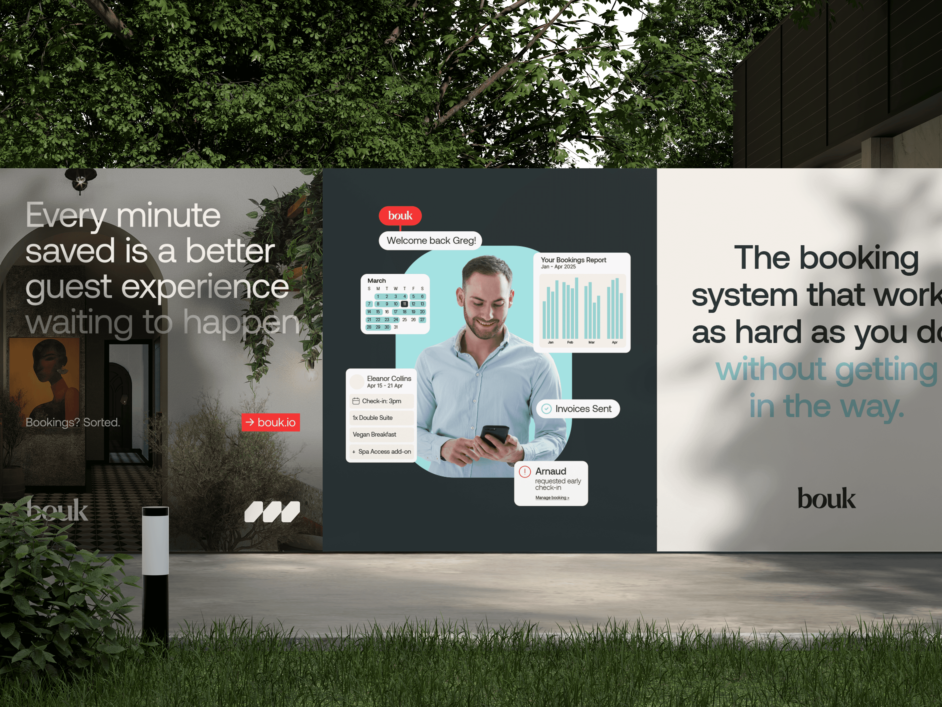
Before the rebrand, Bouk’s visual identity and user interface looked generic and uninviting. The brand blended into a sea of clunky, overpriced booking software. Busy screens, an indistinct logo and impersonal visuals made the product feel like just another tool, rather than a partner. The design didn’t convey Bouk’s promise of smooth operations and stress‑free bookings, nor did it express its warm, human ethos.

Role & Scope
My Role
Brand identity & logo refinement
Visual system & colour palette
Typography selection
Motion & interaction design
Art direction & Imagery
UI & Layout design
Brand identity & logo refinement
Visual system & colour palette
Typography selection
Motion & interaction design
Art direction & imagery
UI & layout design
As the lead and sole designer, I oversaw the entire creative process:
Designed a stylised logo and supporting marks
Developed a user‑friendly, UI‑led design system
Selected and implemented typography and colour palette
Directed photography and imagery style
Conceptualised motion and interaction guidelines
Produced social and marketing templates
Deliverables
Primary and secondary logomarks
Typography and colour framework
Identity system guidelines
Motion concepts & interaction direction
Curated photography & art direction
Responsive UI design (web)
Comprehensive logo suite with clear usage guidelines
Typographic hierarchy (Aeonik & Inter) and colour system
Modular UI components and layout standards
Photography direction and editorial guidelines
Motion and iconography design language
Social and marketing assets aligned with the content strategy

APPROACH
The design process began by reframing heritage. Rather than discarding the original word-mark, I peeled back heavy gradients, drop shadows and the outdated tagline to reveal its core form . This refined logotype was recoloured and decoupled from the brand mark, creating an ethereal, premium aesthetic while maintaining the brand
The rebrand began with a simple question: how do you make something as functional as booking software feel effortless and inviting? I looked to Bouk’s mission—removing hassle and enabling people to focus on what matters—and built a design philosophy around ease, warmth and distinction. Rather than following industry clichés, we aimed to create a visual language that signals reliability without feeling corporate.
Typography and colour were chosen to mirror the logo’s forms. Neulis Sans, with letterforms echoing those in the word-mark, provided cohesion across touch-points. A restrained palette and typographic hierarchy created calm and legibility.
Motion was used as a design material rather than decoration. On the web platform subtle transitions, concepted using GSAP and ScrollSmoother, introduced rhythm and precision, enhancing the user experience without distracting from content .
To shift away from generic tech motifs, the art direction focused on the natural world. Large‑scale photography of serene landscapes and natural phenomena highlighted the environmental impact of Eatron’s technology. A softer palette and refined layouts reinforced this connection, reframing the brand as working with nature rather than apart from it.
Key to this was establishing a sense of calm. I explored ways to translate the ethos of “less faff, more flow” into every element of the brand. We knew the identity had to stand apart from competitors, so I worked on a bespoke mark that feels both modern and approachable. To humanise the technology, the visual direction leaned into genuine human moments and thoughtful composition. At the same time, the interface framework needed to be simple and intuitive, so that users could navigate without friction.


CRAFT & EXECUTION
Logo & Identity System
Designed a custom logomark supported by a secondary BDDFS mark for flexibility
Built a modular identity system that adapts across formats and contexts
Focused on proportion, spacing, and restraint to communicate trust and stability
Typography & Colour
Selected typefaces that balance professionalism with warmth
Established hierarchy rules to ensure clarity across long-form and digital content
Refined spacing and alignment to create a composed, considered rhythm
Motion & Interaction
Photography & Imagery
Developed a restrained colour palette to support legibility and consistency
Used colour sparingly to guide attention without overwhelming content
Ensured the palette worked effectively across digital and print environments
Art Direction & Imagery
UI & Layout Design
Designed a clean, structured interface to clearly present services and content
Prioritised hierarchy and readability over visual noise
Created layouts that feel calm and intuitive, supporting trust and navigation
(Design role only – development by Snap team)


The Result
Eatron now owns a refined and cohesive identity that aligns public perception with scientificreality.
BDDFS launched with a refreshed identity that feels modern, credible, and cohesive.
The new Bouk identity transforms the brand from a functional booking tool into an inviting, modern platform.
The new visual system balances heritage with progression, presenting Eatron as a modern, confident and responsible leader in electrification. The website distills complex technology into clear, accessible storytelling and provides an intuitive interface that matches the pace and precision of the company itself.
The new visual system supports clearer communication across brand, digital and print touch-points, positioning the business with confidence as a trusted financial partner.
The stylised logo offers distinction, the UI system brings clarity and ease of use, and the photography and colour palette humanise the technology. Together, these elements communicate Bouk’s promise of effortless bookings and support its goal of helping businesses focus on delivering great experiences.
Learning
Insights I learned from this project:
Preserving and modernising a loved wordmark can anchor a transformation without losing familiarity.
Natural imagery and restrained palettes can humanise technical brands and elevate emotional resonance.
Motion studies, when grounded in design logic, enhance rhythm and user experience without becoming decoration.
The new visual system supports clearer communication across brand, digital and print touch-points, positioning the business with confidence as a trusted financial partner.

Bouk
A Modern Identity for a Trusted Financial Partner
Brand & Identity
Web Design
PORTFOLIO
More Projects
More Projects
Other Projects


Bouk
Designing an effortless booking platform
Brand & Identity
2024
2024
2024
Overview
Bouk is an online booking platform was created to take the hassle out of bookings, offering businesses a seamless, smart and stress‑free way to run and grow. The founders wanted to reflect this mission with a distinctive identity and user experience.
Problem
The previous identity lacked cohesion, clarity and modernity. Heavy gradients, drop shadows and abstract tech motifs obscured the logo’s core form, and the website relied on generic tech aesthetics that no longer reflected Eatron’s sophistication. There was no unified system to express safety, precision or innovation. The challenge was to translate complex battery technology into clear, confident design while preserving the heritage embodied in the original wordmark.
Role & Scope
My Role
Brand identity & logo refinement
Visual system & colour palette
Typography selection
Motion & interaction design
Art direction & Imagery
UI & Layout design
Deliverables
Primary and secondary logomarks
Typography and colour framework
Identity system guidelines
Motion concepts & interaction direction
Curated photography & art direction
Responsive UI design (web)
APPROACH
The design process began by reframing heritage. Rather than discarding the original word-mark, I peeled back heavy gradients, drop shadows and the outdated tagline to reveal its core form . This refined logotype was recoloured and decoupled from the brand mark, creating an ethereal, premium aesthetic while maintaining the brand
Typography and colour were chosen to mirror the logo’s forms. Neulis Sans, with letterforms echoing those in the word-mark, provided cohesion across touch-points. A restrained palette and typographic hierarchy created calm and legibility.
Motion was used as a design material rather than decoration. On the web platform subtle transitions, concepted using GSAP and ScrollSmoother, introduced rhythm and precision, enhancing the user experience without distracting from content .
To shift away from generic tech motifs, the art direction focused on the natural world. Large‑scale photography of serene landscapes and natural phenomena highlighted the environmental impact of Eatron’s technology. A softer palette and refined layouts reinforced this connection, reframing the brand as working with nature rather than apart from it.
CRAFT & EXECUTION
Logo & Identity System
Designed a custom logomark supported by a secondary BDDFS mark for flexibility
Built a modular identity system that adapts across formats and contexts
Focused on proportion, spacing, and restraint to communicate trust and stability
Typography & Colour
Selected typefaces that balance professionalism with warmth
Established hierarchy rules to ensure clarity across long-form and digital content
Refined spacing and alignment to create a composed, considered rhythm
Motion & Interaction
Developed a restrained colour palette to support legibility and consistency
Used colour sparingly to guide attention without overwhelming content
Ensured the palette worked effectively across digital and print environments
Art Direction & Imagery
Designed a clean, structured interface to clearly present services and content
Prioritised hierarchy and readability over visual noise
Created layouts that feel calm and intuitive, supporting trust and navigation
(Design role only – development by Snap team)
The Result
Eatron now owns a refined and cohesive identity that aligns public perception with scientificreality.
The new visual system balances heritage with progression, presenting Eatron as a modern, confident and responsible leader in electrification. The website distills complex technology into clear, accessible storytelling and provides an intuitive interface that matches the pace and precision of the company itself.
Learning
Insights I learned from this project:
Preserving and modernising a loved wordmark can anchor a transformation without losing familiarity.
Natural imagery and restrained palettes can humanise technical brands and elevate emotional resonance.
Motion studies, when grounded in design logic, enhance rhythm and user experience without becoming decoration.
Bouk
A Modern Identity for a Trusted Financial Partner
Brand & Identity
Web Design
PORTFOLIO
More Projects
More Projects
Other Projects
Bouk
Designing an effortless booking platform
Brand & Identity
2024
2024
2024
Overview
Bouk is an online booking platform was created to take the hassle out of bookings, offering businesses a seamless, smart and stress‑free way to run and grow. The founders wanted to reflect this mission with a distinctive identity and user experience.
Problem
The previous identity lacked cohesion, clarity and modernity. Heavy gradients, drop shadows and abstract tech motifs obscured the logo’s core form, and the website relied on generic tech aesthetics that no longer reflected Eatron’s sophistication. There was no unified system to express safety, precision or innovation. The challenge was to translate complex battery technology into clear, confident design while preserving the heritage embodied in the original wordmark.
Role & Scope
My Role
Brand identity & logo refinement
Visual system & colour palette
Typography selection
Motion & interaction design
Art direction & Imagery
UI & Layout design
Deliverables
Primary and secondary logomarks
Typography and colour framework
Identity system guidelines
Motion concepts & interaction direction
Curated photography & art direction
Responsive UI design (web)
APPROACH
The design process began by reframing heritage. Rather than discarding the original word-mark, I peeled back heavy gradients, drop shadows and the outdated tagline to reveal its core form . This refined logotype was recoloured and decoupled from the brand mark, creating an ethereal, premium aesthetic while maintaining the brand
Typography and colour were chosen to mirror the logo’s forms. Neulis Sans, with letterforms echoing those in the word-mark, provided cohesion across touch-points. A restrained palette and typographic hierarchy created calm and legibility.
Motion was used as a design material rather than decoration. On the web platform subtle transitions, concepted using GSAP and ScrollSmoother, introduced rhythm and precision, enhancing the user experience without distracting from content .
To shift away from generic tech motifs, the art direction focused on the natural world. Large‑scale photography of serene landscapes and natural phenomena highlighted the environmental impact of Eatron’s technology. A softer palette and refined layouts reinforced this connection, reframing the brand as working with nature rather than apart from it.
CRAFT & EXECUTION
Logo & Identity System
Designed a custom logomark supported by a secondary BDDFS mark for flexibility
Built a modular identity system that adapts across formats and contexts
Focused on proportion, spacing, and restraint to communicate trust and stability
Typography & Colour
Selected typefaces that balance professionalism with warmth
Established hierarchy rules to ensure clarity across long-form and digital content
Refined spacing and alignment to create a composed, considered rhythm
Motion & Interaction
Developed a restrained colour palette to support legibility and consistency
Used colour sparingly to guide attention without overwhelming content
Ensured the palette worked effectively across digital and print environments
Art Direction & Imagery
Designed a clean, structured interface to clearly present services and content
Prioritised hierarchy and readability over visual noise
Created layouts that feel calm and intuitive, supporting trust and navigation
(Design role only – development by Snap team)
The Result
BDDFS launched with a refreshed identity that feels modern, credible, and cohesive.
The new visual system supports clearer communication across brand, digital and print touch-points, positioning the business with confidence as a trusted financial partner.
Learning
Insights I learned from this project:
The new visual system supports clearer communication across brand, digital and print touch-points, positioning the business with confidence as a trusted financial partner.
Bouk
A Modern Identity for a Trusted Financial Partner
Brand & Identity
Web Design
PORTFOLIO